mandara
Your desktop: bar, looks and widgets
How Mandara looks and feels, and how much of it you can shape.
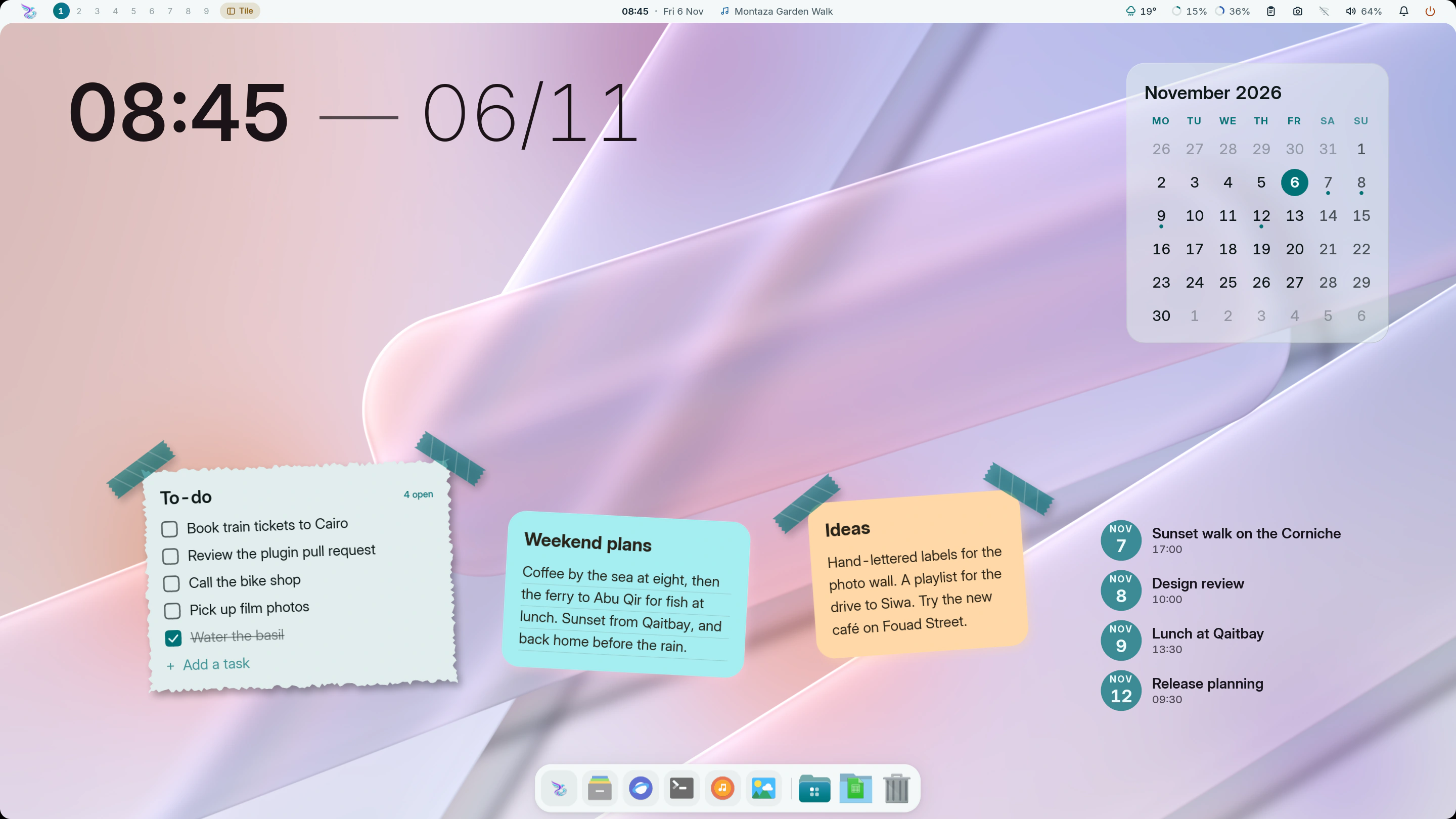
The demo desktop in light mode (mandara msg theme mode light).
Shape it your way
- Every corner, one dial. Corner roundness scales every radius in the shell (bar, panels, sidebar, cards, chips, launcher, OSD, dock), keeps nested corners concentric, and updates live, open panels included.
- Bar, your way: edge frame (flush or floating), glass pills, island, a
24 px hairline dense with live stats, a single micro pill, a
notch that hangs from the top edge on curved shoulders, or a slim
side bar on the left or right edge with an optional screen frame
(panels open sideways from it). Each style has its own radius, item padding
and spacing, separators, group or item capsules (soft, card-toned or
accent, with an optional outline), center-group alignment, accent tint,
glass rim, shadow, text and icon size, text weight and a hover highlight
you can switch off. Keep extra space between the bar and your windows,
and choose what right-clicking, middle-clicking and scrolling on empty
bar space do (main menu or desktop menu; any hot-corner action;
workspaces or volume).
mandara msg bar hide/show/toggleputs the bar away until you want it back. - Bars that look nothing alike. Eight style presets in Studio → Bars
reshape the whole bar: Expressive (a tall bottom bar inside a frame
round the screen, joined to a rail on the left: round accent buttons,
tonal tiles for the widgets and scalloped badges down the rail),
Tile dock (one floating island of large squircle tiles at the
bottom), Rail (a wide left rail of flower-shaped buttons in a screen
frame), Segmented (no bar at all, just rows of connected tiles
under the top edge), System monitor (a dense status line along the
bottom: every reading on a square-cornered stat block, meters and rates
in the middle, in your monospace font), Stanley Bridge (Tile dock
split into three floating docks of tertiary squircles spanning the
bottom), Pharos Beam (a narrow lantern of tonal tiles and scalloped
accent buttons hanging from the top edge) and Raml Tram (one line of
flower stops running along the top and down the left edge: a top bar
joined to a rail). In every style the workspace and tag buttons take the
bar’s own shapes and show the icon of the app on each tag. They’re built from settings you can keep tuning:
items as capsules, tiles, squircles or connected groups; icon items as
circles or Material 3 Expressive cookies, clovers, flowers and bursts in
the accent or tertiary tone; the items’ inset from the bar’s edges; and
a screen frame round a top or bottom bar too. Panels still pour out of
the bar and morph back into the item they came from.
mandara msg bar style expressivescripts it. Each side bar can take a style of its own too (Studio → Bars → Side bars, ormandara msg side-bar style right tile-dock), so a rail of squircle tiles can sit beside a bar of connected groups. - Bar items show what you want: workspace pills with numbers, short names or dots, with or without app icons, and empty ones hidden; the active window as its app, its title or both, up to a width you pick; the volume and battery with or without their numbers; the track title or just the music icon, hidden while paused if you like. The bar’s three groups never overlap: a group gets the room up to its neighbour, a long window title ends in an ellipsis there, and on a very narrow bar the items nearest the middle make way first.
- Side bars of icons and pills: turn on a slim bar on the left and right edges (Studio → Bars → Side bars) and fill its top, middle and bottom groups with any plugins; their panels pour out sideways. By default the top bar and both side bars join into one frame with curved corners; or let them float apart as glass pills, an island or a slab with their own opacity, accent tint, frosted glass, rim light and shadow. Pin each side so windows tile beside it, or let it slide away until your pointer rests on its edge. Width, item size, padding, spacing and style, corners, curves, the middle group’s place and an accent colour per side are all yours. They take over the widget sidebar’s edge while they’re on. Details
- Sidebars fit like puzzle pieces: a flush sidebar takes the bar’s material and meets it with the same concave curves: it hangs from the edge frame, turns the hairline’s accent line down its edge, merges into the notch, and continues a side bar’s strip. Beside floating styles it floats too.
- Panels you can shape: drop-down panels get width, maximum height, padding, gap to the bar, anchoring, opacity, shadow, an open animation (morph, fade and slide, or none) and their own spring; the sidebar and power dock sit flush or float, with their own radius, card styling, header layout and tab position.
- Studio explains itself: every page reads like a short table of contents. Related settings sit together in collapsible sections, each with a one-line preview of what’s inside and how many you’ve changed. Controls that don’t apply to your current layout say why, and every section has a one-click Reset.
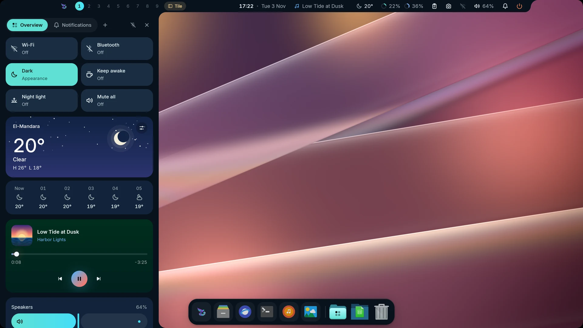 Notch: the flush sidebar merges into it |
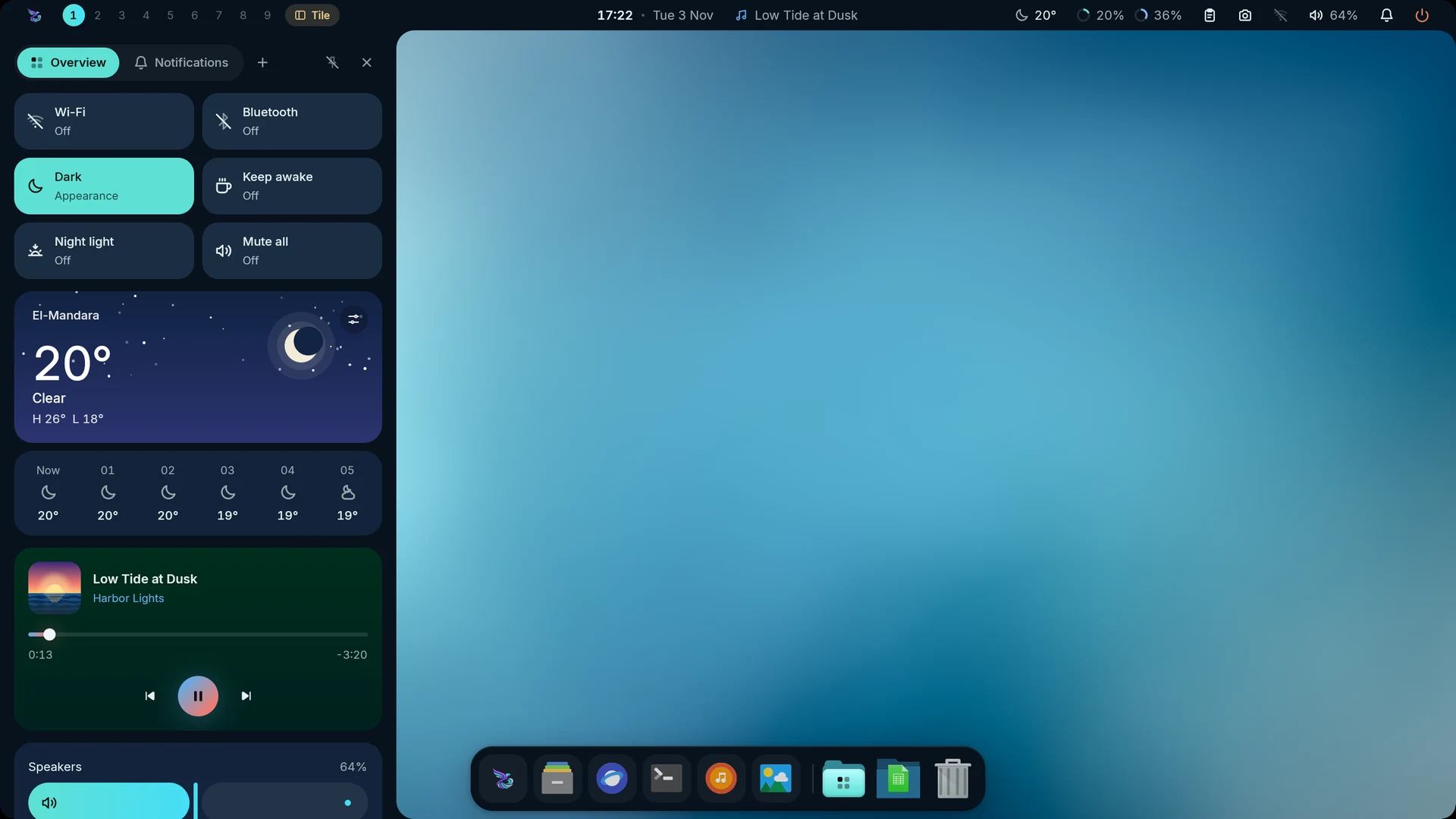 Edge frame: the sidebar hangs from the frame |
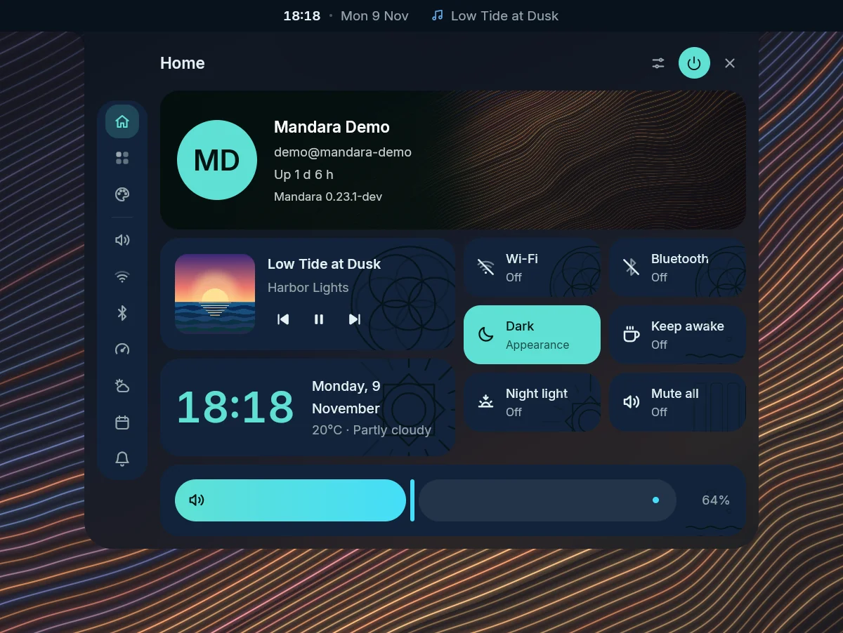
Right-click empty bar space for the main menu.
The rail on its side switches the menu’s own pages (Home, Apps & tools and Look). Below a divider, under Panels in the full rail, come shortcuts that open Sound, Network, Bluetooth, the system monitor, weather, the calendar or notifications in the menu’s place. Studio and the power menu are the buttons at the top, so the rail doesn’t repeat them; Reload config is on Apps & tools. Rail (Studio → Bars → Drop-down panels, under Main menu) shows each entry’s name or icons only, and Rail height keeps the rail as tall as its buttons or stretches it to the panel’s height with its buttons spread evenly from top to foot (the divider stays halfway between the pages and the shortcuts), over a mashrabiya lattice rising from its foot and fading out on its way up.
On a split bar (glass pills, island, micro pill, notch, Segmented, Tile dock) the gaps between the pieces are the desktop, so right-clicking them opens the desktop’s menu. Turn on Main menu in the bar’s gaps (Studio → Bars → Bar → Behaviour) and a right-click anywhere in the bar’s strip opens the main menu instead. Studio locks that switch until a right-click on empty bar space opens the main menu: first set Right-click on empty bar space to The bar’s main menu and turn Click through empty space off, both in the same Behaviour section (see Configuration → Main menu). The desktop’s menu is still a right-click anywhere else on the desktop, or Desktop menu on the main menu’s Apps & tools page, which opens it where you clicked.
Open Look in the main menu to pick a theme. The cards fill the available height; longer catalogs use compact scrolling rows. Built-in names follow your language in the menu and Studio, while custom theme names stay as you wrote them.
Looks

The six Looks, one click each in Studio → Themes.
- Looks: six original one-click desktop looks in Studio → Themes, right under
the live preview of your current theme:
Corniche Dusk, Pharos Ink, Montaza Crimson, Qaitbay Forest,
Anfushi Wave and Night Frame. Each sets the bar style, widgets,
palette (generated by Mandara’s HCT/OKLCH engine), typography and radii
together. Your own setup is saved first, and Restore my look brings it
back in one click. Switching looks also switches off the plugins the last
look turned on (never ones you had on). Looks never change your wallpaper;
Use my wallpaper’s colors keeps its palette.
mandara msg look list|apply|restorescripts them. - Cursor themes (opt-in plugin,
cursors): switched off, Mandara leaves your cursor configuration alone entirely and Studio → Themes shows a one-line card to turn it on. Switched on, Studio → Themes → Cursor shows your cursor drawn from its own files at its size, every cursor setting (size with 24 / 32 / 48 / 64 px chips, hide while typing, hide when idle, the software cursor of Hyprland and Umbriel and Hyprland’s hide on touch) and a gallery of the ten most popular ricing cursor themes — Bibata Modern, macOS, Qogir, Phinger, Catppuccin, BreezeX, Vimix, Banana, Nordzy and Rosé Pine — with author, licence and variants. One click downloads the pinned GitHub release, verifies its SHA-256 and installs it to~/.local/share/icons; Apply changes the cursor live on MangoWM, Niri, Hyprland, Umbriel, Sway and River (and X11 apps through~/.icons/default); Remove only ever deletes what Mandara installed. Nothing is bundled in the binary.mandara msg cursor list|install|apply|removescripts it.
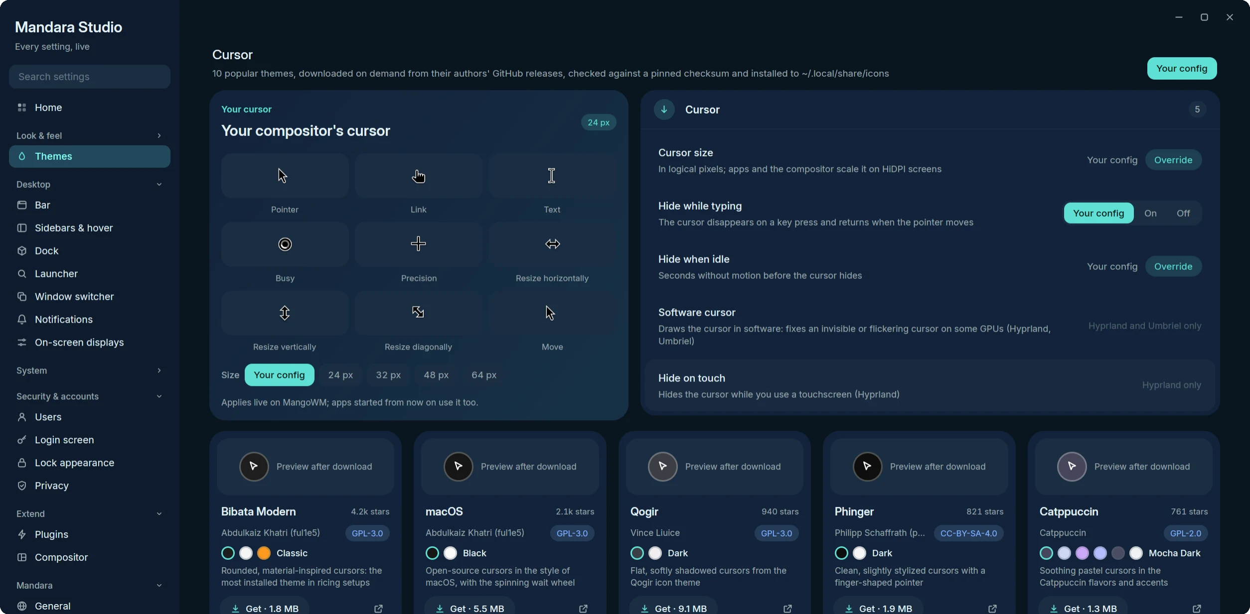
Studio → Themes → Cursor: the applied cursor, its settings and the theme gallery.
 Corniche Dusk |
 Pharos Ink |
 Montaza Crimson |
 Qaitbay Forest |
 Anfushi Wave |
 Night Frame |
Desktop widgets
Ten new designs extend the existing families:
| Family | Designs |
|---|---|
| Desktop clocks → Digital | Word clock, Split-flap clock, Glass tube clock, Binary clock |
| Calendar card | Date ticket, Perpetual calendar, Moon calendar |
| Desktop weather | Weather ribbon, Thermometer, Humidity rose |
The word clock gives the nearest five-minute phrase with the exact time underneath. Binary columns encode the four displayed decimal digits. The moon calendar follows the civil month, including leap years, and calculates each day’s phase. The thermometer uses today’s reported range; missing weather produces an unavailable state rather than a sample reading.
Add them in Studio → Desktop widgets → Add a widget. Clock families have a Style choice; weather and date widgets have a Layout choice. Their size, colour, font, plate and placement use the same editor as the existing widgets. Eligible kinds can also be added to login and lock screens.
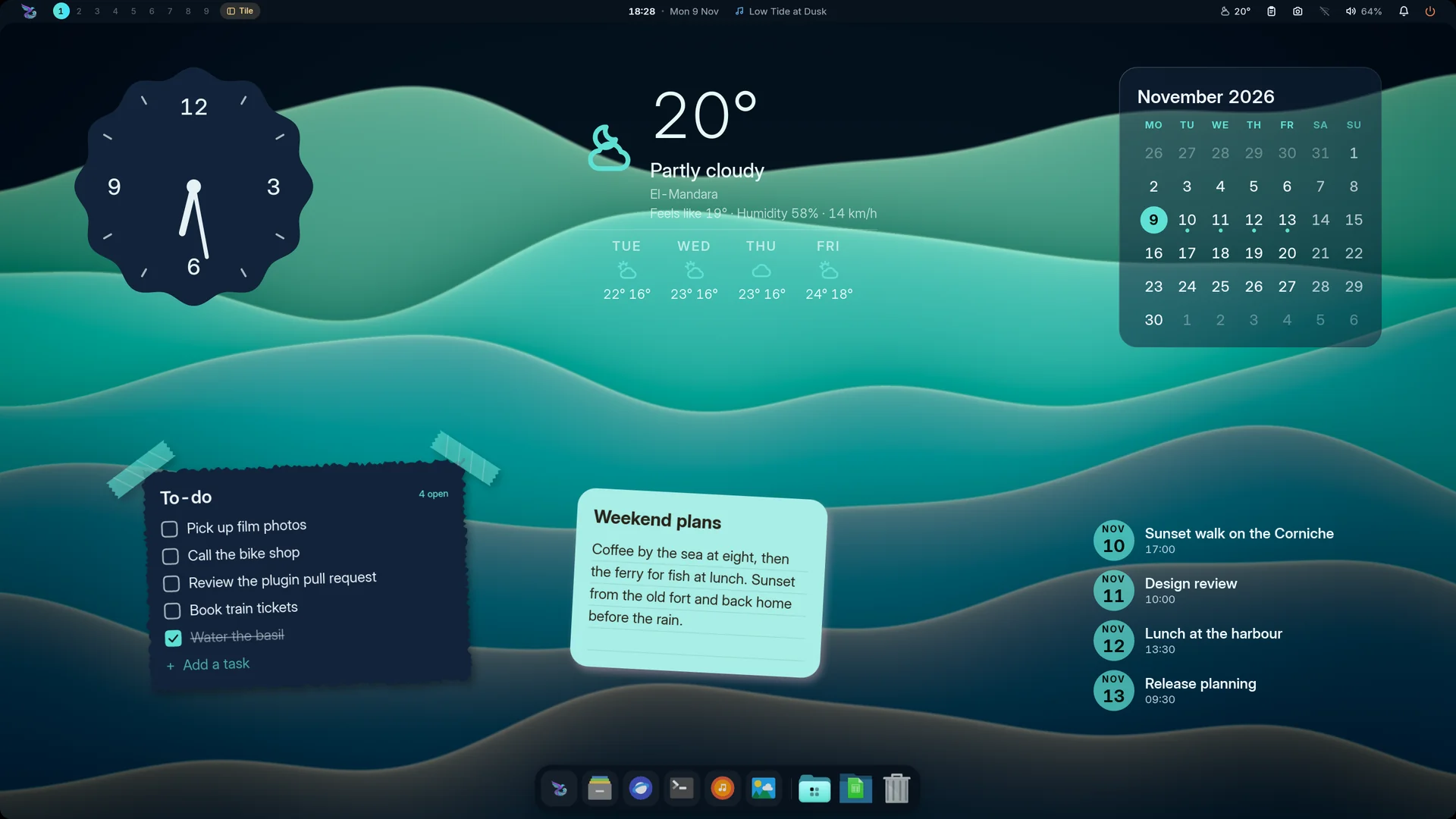 Productivity: a to-do list you tick, a sticky note, the focus timer, calendars |
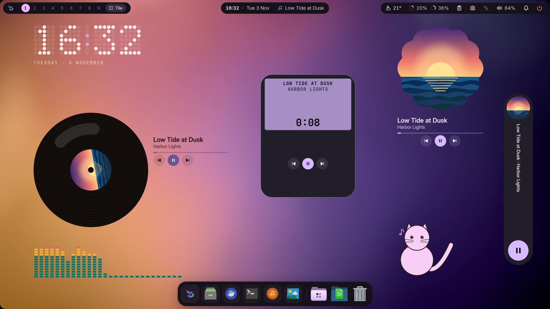 Now playing, an LED meter and the desk cat |
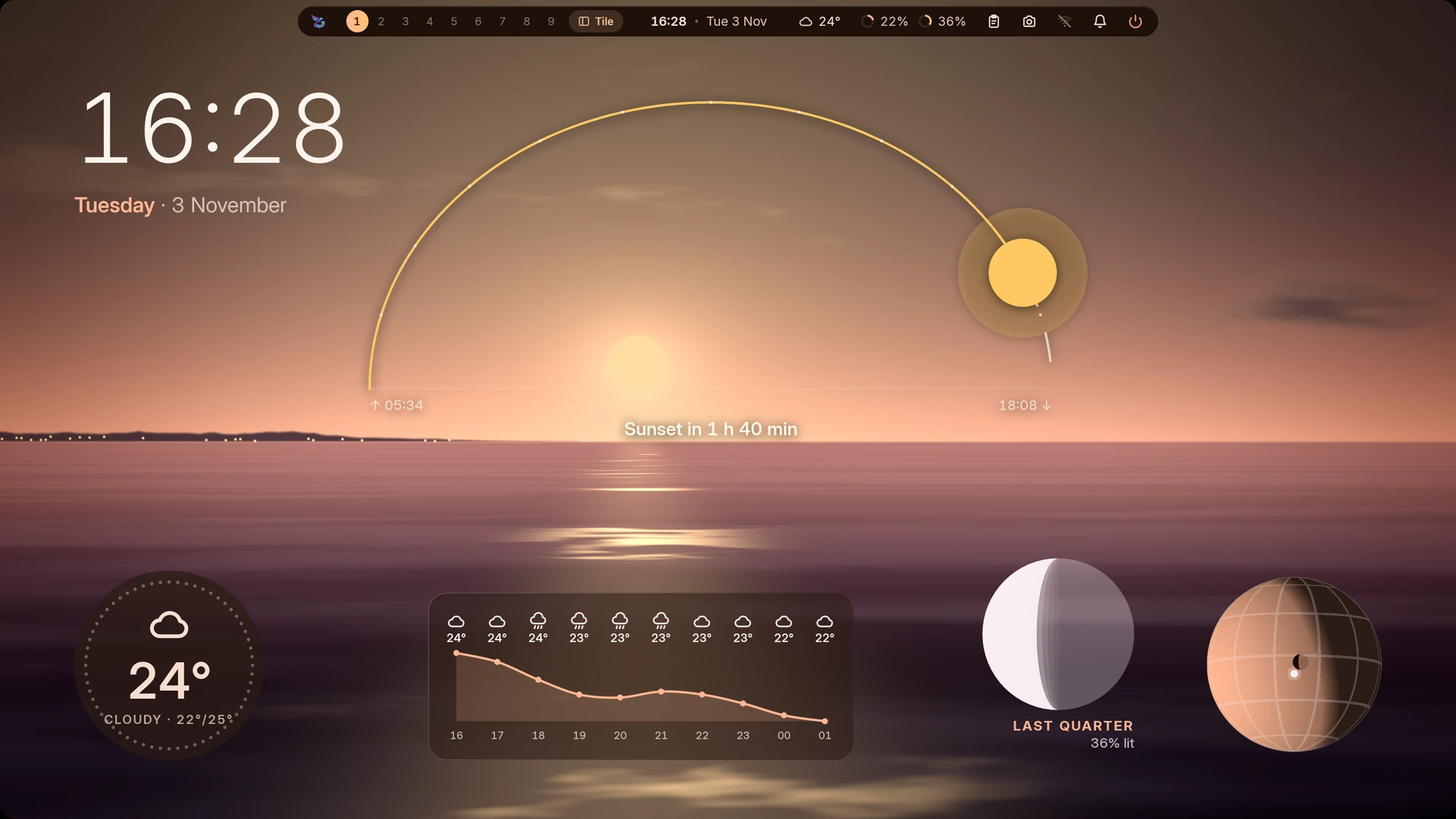 Sky and weather: the sun's arc, the moon, a globe, a disc and an hourly curve |
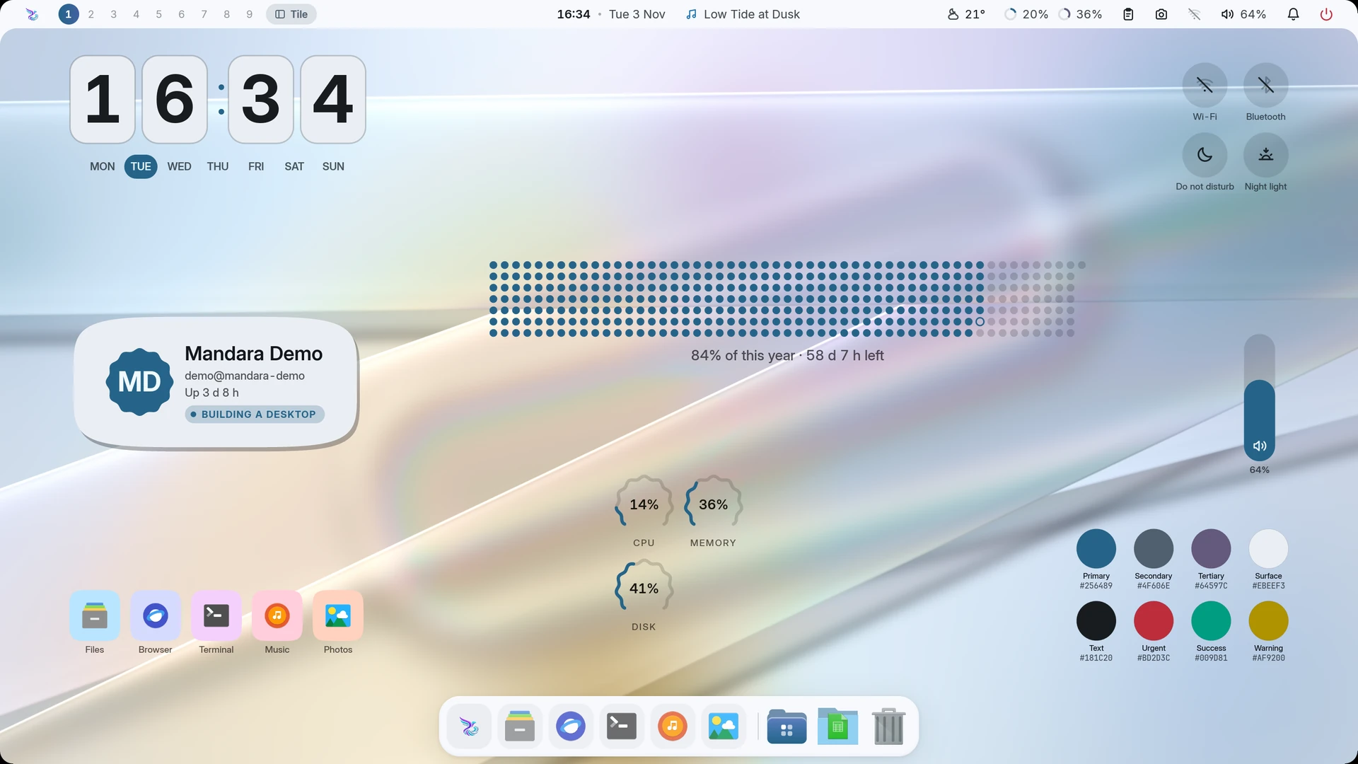 You and your shortcuts: a profile card, toggles, sliders and the palette |
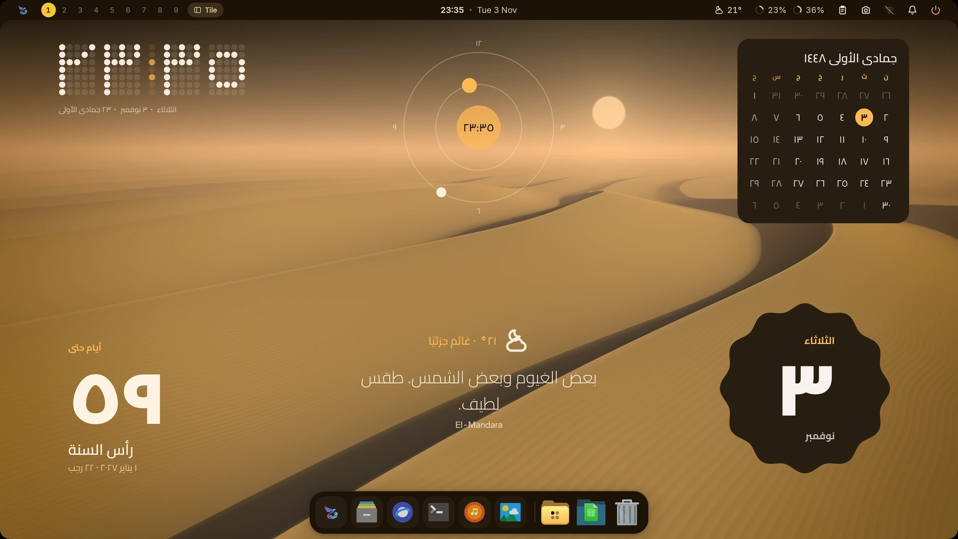 Numerals, calendars and language: Eastern Arabic digits, the Hijri month and Arabic day names |
|
- Desktop widgets: hero clocks (superscript, headline, day block, ring, greeting, giant day numeral, minimal, and an analog dial with an optional seconds hand), a system monitor as a column with live graphs or as ring gauges (CPU, memory, swap, every GPU’s load, video memory, temperature and power, disk, network and battery, each one yours to switch on or off, also from its right-click menu in Edit desktop), the weather with the days ahead, a world clock, a countdown to a date, text and shape decorations (discs, stripes, waves, frames, and vertical text: kana and CJK stand upright, Arabic and Latin keep their joined line turned toward the screen’s middle) and an audio visualizer that can sit behind the wallpaper’s subject. Every widget stays fully on screen and clear of the bar at any resolution. They’re drawn in software into small shared-memory layers: no video memory, redrawn only when they change, nothing runs until you add one, and a removed widget’s layer is freed at once. Moving one only moves its layer: it is painted again once, where you drop it.
- Many more widgets: nine more clock faces (a stacked card, the time
in a shape, dot-matrix and pixel digits, a digit in each box, a slanted
HUD, hands over giant numerals, an orbit, and text lines you write from
placeholders; in Studio’s gallery the look-alike faces share one tile
per family, Stacked, Analog, Digital, Text, each with a
Style choice), day / week / month / year progress, a to-do list you tick
on the desktop, a sticky note, the focus timer, a quote card, notebook
tabs, painted month / week / agenda / date-tile calendars, the sun on its
arc, the moon’s phase, a day-and-night globe, the weather as a sentence,
a disc or an hourly chart, a profile card, app and folder shortcuts,
quick toggles whose tiles change shape when switched, volume and
brightness sliders, the theme’s palette, a desk cat, bubbles, a photo
frame, stickers, what plays on a turning record, a pocket player, a
shaped or halftone cover, a side pill or as lyrics, an LED meter,
system meters, bars and thermals, a machine card, screen time, prayer
times, a search field, an “at a glance” line, your GitHub contribution
year, exchange rates, Claude Code’s token use and your Steam games.
Clicks work on the desktop itself (tick, toggle, start, open, copy,
play), and
mandara msg desktop widgets press <id> <action>does the same from a script. Clocks and calendars redraw once a minute; only the cat, the bubbles, a playing record and a seconds hand animate, and only while the desktop is in sight. GitHub and exchange rates go online only once you switch that on, and the AI usage widget reads its logs only once you allow it. A widget that needs setting up (no GitHub user, fetching off, its plugin off) or has nothing yet shows its icon, a short line saying why and, where a setting fixes it, a Set up in Studio button that opens exactly that setting. Studio’s gallery shows each widget with sample data, marked Preview. - Any shape, any frame: every painted widget can sit on a circle, a squircle, a scalloped cookie, a flower, a pentagon, chamfered corners, a slanted card or torn paper, with an outline, a soft or hard directional shadow, a header line, and a frame (a classic window title bar, washi tape or a polaroid). Any widget can be turned and mirrored. The same shapes are offered wherever a widget draws a check box, a cell, a cover or a marker, so a widget can look like the original you have in mind or like nothing seen before. Studio → Desktop widgets → Shape and frame.
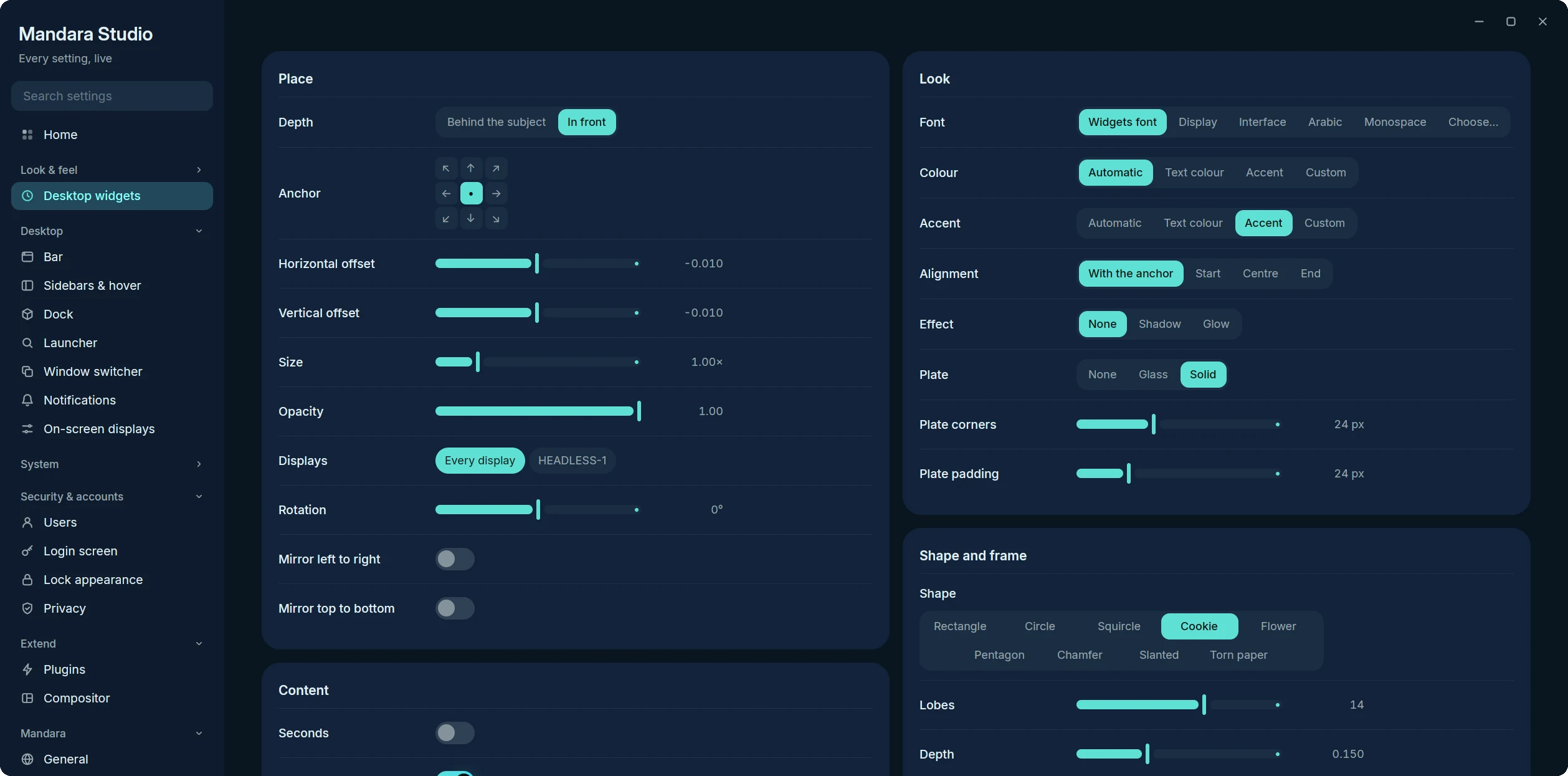
Studio → Desktop widgets: the plate, Shape and frame, outline, shadow, chrome and header of one widget.
- Each widget, your way: size, opacity, colour and accent (automatic
over the wallpaper, the theme’s, or your own
#rrggbb/oklch(…)), alignment, a shadow or glow and its strength, and a frosted glass or solid plate behind it with its own opacity, corners and padding. Fonts follow Typography → Desktop widgets (the display face until you choose one), and any widget can take another role or its own family from the searchable font list. - Numbers, dates and language: every widget that writes numbers or
dates has its own numerals (from the language, Western
123or Eastern Arabic١٢٣), calendar (Gregorian, Hijri, both or none; the Hijri day begins at sunset and follows the Prayer times correction), the Hijri date in Arabic or in the widget’s language, and a language for day and month names (it also sets the reading direction). Widgets made before these options keep what they showed. - Widgets are plugins: each kind comes from a first-party plugin in Studio → Plugins → Desktop widgets (Desktop clocks, System monitor, Desktop decorations, Desktop visualizers, Now playing card, Calendar card, Desktop weather, Desktop world clock, Countdown, Desktop productivity, Desktop sky, Desktop shortcuts and you, Desktop fun, Desktop info). Switching one off hides its widgets without removing them and takes it out of the Add widget menus. Third-party WebAssembly plugins can offer desktop widgets too (PLUGINS.md).
- Desktop cards: a now-playing card (art, wavy progress, synced lyrics) and a calendar card, each on its own tiny surface that exists only while shown.
- Games on the desktop: with the opt-in Sudoku and 2048 plugins on, their boards are widgets you play right on the desktop. Click one to give it the keyboard and click anywhere else to give it back. Studio → Desktop widgets sets each one’s width and style (Glass, Solid or Minimal). See Games.
- Visualizers: a glowing wave along a screen edge, framed bars or a mirrored strip. They listen only while music plays and drop to zero CPU after a few seconds of silence.
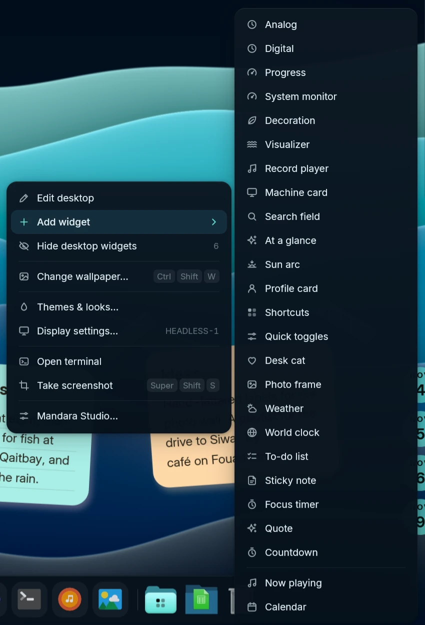 Right-click the desktop |
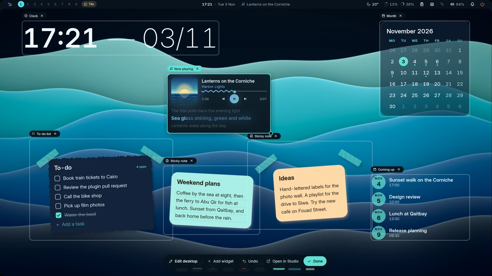 Edit the desktop in place |
- Right-click the desktop for a glass menu: Edit desktop, Add widget ▸ (a few widgets from every desktop widget plugin that’s on: clocks, day progress, the system monitor or gauges, a decoration, a visualizer, the record player, a machine card, a search field, an “at a glance” line, the sun’s arc, a profile card, shortcuts, quick toggles, the desk cat, a photo frame, weather, a world clock, a to-do list, a sticky note, the focus timer, a quote, a countdown, the now-playing and calendar cards and any third-party plugin’s widgets; Studio has the rest), show / hide widgets, change or skip the wallpaper, Themes & looks, display settings, a terminal, a screenshot and Studio.
- Edit the desktop in place: every widget gets an outline and its name. Drag to move it, pull the corner to resize, and it snaps to the screen’s edges and centre lines. The × on a widget’s name removes it in one click; right-click it to duplicate or hide it. With more than one monitor, the same menu keeps a widget Only on this display (or shows it on every display again), and a widget you add goes on the monitor you added it on, so each screen can have its own set. Studio → Desktop widgets → Displays picks them too. A floating toolbar has Add widget, Undo, Open in Studio and Done. New widgets start in front of the wallpaper’s subject and on a free spot, so they show the moment you add them. Nothing of it stays in memory once you’re done. The same widgets are in Studio → Desktop widgets, with a live preview; tiles already on the desktop are ticked, and Remove duplicates clears exact copies.
- A now-playing chip can also ride at the end of the dock.
Every value is a setting
Everything you can see or feel is a setting in Mandara Studio: sizes, radii, colours, fonts, springs, delays, refresh intervals, list lengths and alert thresholds. Each has a default, a bounded range and a reset, and applies live. Plugin options (refresh rates, rows shown, warning levels) live in each plugin’s settings window, and docs/configuration.md lists every setting by Studio page. A test keeps new hard-coded sizes and timings out of the shell: anything that must stay fixed is a named, documented constant.
Sound
- Mute all: one switch (sound panel, quick settings, middle-click on the
bar’s sound icon,
audio mute-all toggle) mutes every output, hardware and virtual sinks such as EasyEffects’, and every app. New sounds stay muted while it’s on, it survives a shell restart, and it restores exactly what you had muted yourself. - Per-app volume: every app playing sound gets a row with its icon,
what it’s playing, a volume slider (to 150 %), mute and a button that moves
it to another output. Several streams of one app fold into one row. The
row of the player the media panel controls sets that player’s own volume
(0–100 %, like its own slider) when the player allows it, because such a
player puts its level back on its sound whenever you play or pause.
Studio’s mixer does the same, and
media volume set 40sets it from a terminal (media statusreports it asvolume, 0–1, ornull). - Shell sounds from your freedesktop sound theme, decoded in pure Rust, quiet while media plays.
Keyboard shortcut cards
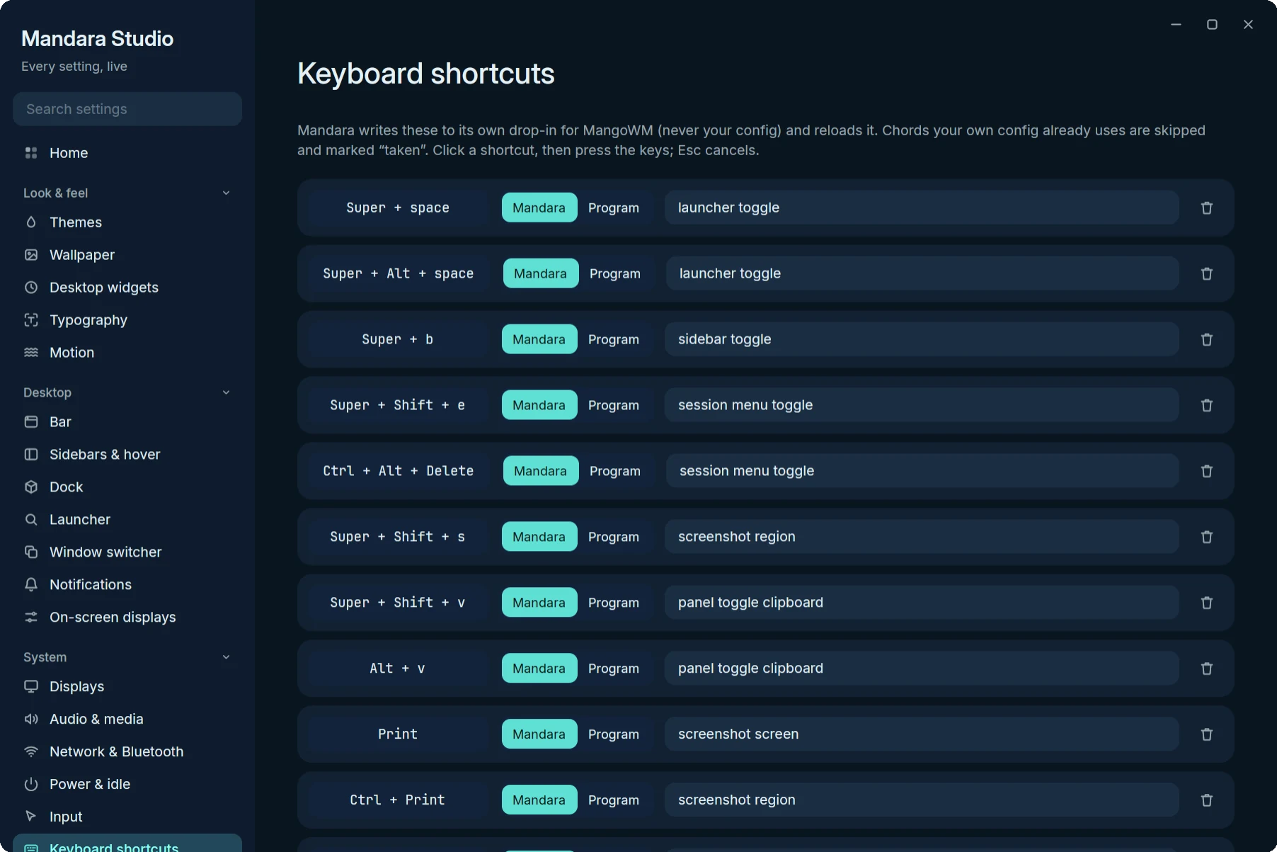
Studio → Keyboard shortcuts: Alt+V for the clipboard, Print for screenshots, and the Used by your config, Duplicate and Needs Super, Ctrl or Alt badges.
Studio → Keyboard shortcuts shows every binding as a card. Click the keycap
chip and press the keys to record a new chord. Each card checks itself as
you type: Duplicate when two Mandara binds share a chord, Needs
Super, Ctrl or Alt when a bind would swallow plain typing, and Used by
your config with the exact file and line when your own compositor config
already has that chord. Mandara never overrides a key you already use; its
binds go into its own drop-in file for MangoWM, Niri, Hyprland, Umbriel or Sway,
and on River are sent as map commands (keys your init maps stay yours).
Display reconnection
The shell follows displays as they connect, disconnect or change logical size. A monitor returning through a display switch gets its bar and dock back automatically. Choices in Studio → Displays, including Main display and individual connector names, remain saved while a display is away.
Taped notes attach their corner strips to the note’s own sheet, using the same frame decoration as the to-do list. A separate header stays above the paper without moving the strips away from it.
Write directly on the desktop: click a to-do’s words to edit them, its checkbox to change completion, or Add a task to create one. Click a sticky note or notebook tab to edit the full Markdown note at that widget. Done saves; Enter saves a task, and Ctrl+Enter saves a multiline note. Escape or the close button cancels. Clicking elsewhere saves before leaving. The editor uses the same lists and Markdown files as the plugins, so changes appear in every surface. Conflicting edits and failed saves keep your draft visible rather than overwrite newer text.
The editor stays open while the save finishes. File writes, note renames and
task JSON writes run in the background; a disk error leaves the draft ready
to retry. A note whose text saved before its filename or index failed keeps
the same id on retry. A list tag alone, such as #Work, needs task text after it.
Unreadable files stay read-only while their drafts remain available; other
notes stay usable. Recovery scans wait for save capacity and check Notes
plugin drafts against the recovered file. An unchanged file lets the plugin
draft retry; a change found by that scan stays a conflict. For a draft in the
desktop editor, make the file readable and press Done again.
Changing the notes folder waits for pending saves; retained conflicts are available when you return. Desktop note saves compare the file with the text the editor opened. Notes plugin body saves compare it with the text the panel showed when you started typing, or with Mandara’s own last save of that note, so quick edits still save in order. If another program changed or removed the file in the meantime, that note isn’t saved: the panel keeps your text and says it changed elsewhere, other notes still save, and your next edit replaces the outside version on purpose, or recreates the note if its file was removed. Recovery scans check retained baselines separately. None of these operations locks out another editor. A save can still replace an edit made in the instant between its comparison and its write.
The widget gallery fits each preview to its card and renders at the display’s pixel density, with larger calendar and sky miniatures. Media previews use a clearly labelled sample track and cover; they do not need a running player or read your listening history. Quick toggles and sliders show sample states, and the palette tile uses your current theme colours. The desktop still shows only real media and control states.
The bar preset thumbnails show each centered layout’s actual proportions. Micro pill uses a shorter bar, tighter spacing and no empty side-group gaps; Dynamic island keeps a taller shared island with roomier groups. Both remain available in Studio → Bars → Bar → Presets.
With weather enabled, a desktop weather widget keeps its forecast active without a weather item in the bar or sidebar. Weather cards follow the widget’s chosen language and reading direction.