mandara
Mandara Studio
Mandara Studio (mandara studio, app id org.mandara.studio) is the one
place where Mandara is configured. It runs as its own process, so its CPU and
memory never count against the shell, and every change is mirrored to the
running shell over IPC: drag a slider and the bar follows on the very next frame.
Settings never live in bar dropdowns. Pages decode their pictures (plugin
covers and icons, the login-screen preview, cursor previews) at the size they
are drawn and hand them back, textures included, when you leave the page.
Studio draws its own title bar. If KWin requires native window decorations, Studio uses those controls so there is only one set of buttons.
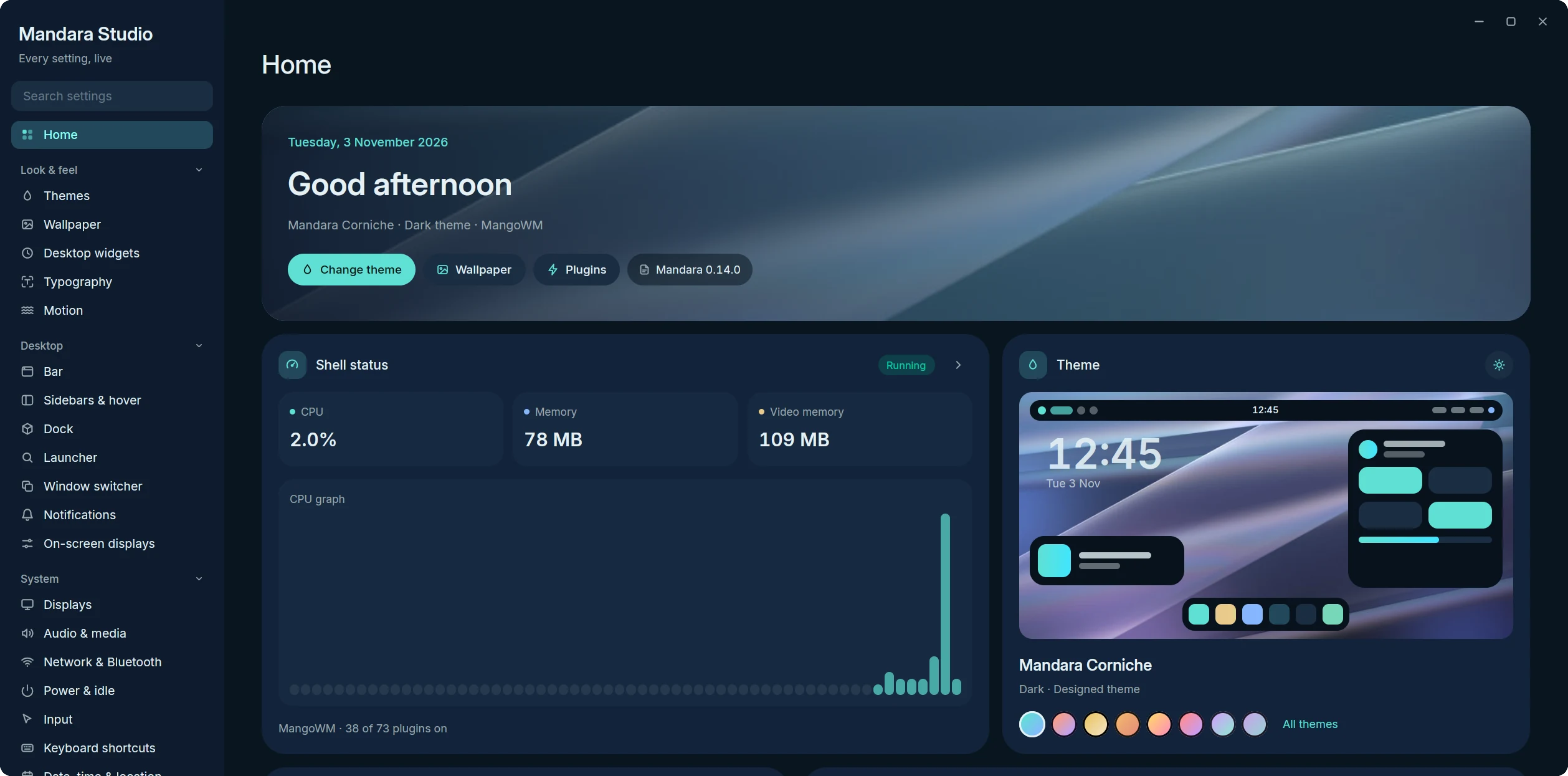
Home: a widget dashboard with live shell status, the current theme and its one-click switches, quick settings and recent changes
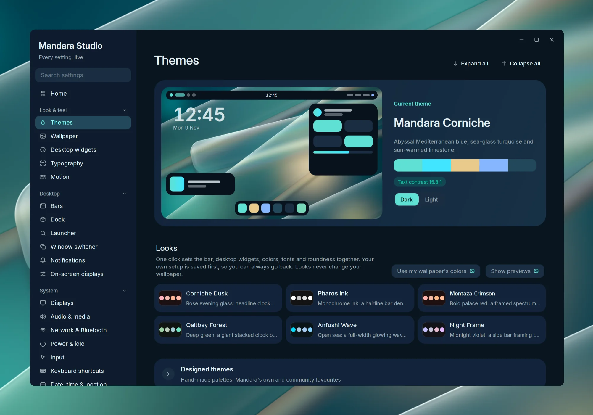
Themes: a live preview of the shell in the current theme, its palette and contrast, light / dark, then the Looks, designed themes, wallpaper colors and cursors
 Navigation: grouped, collapsible, searchable |
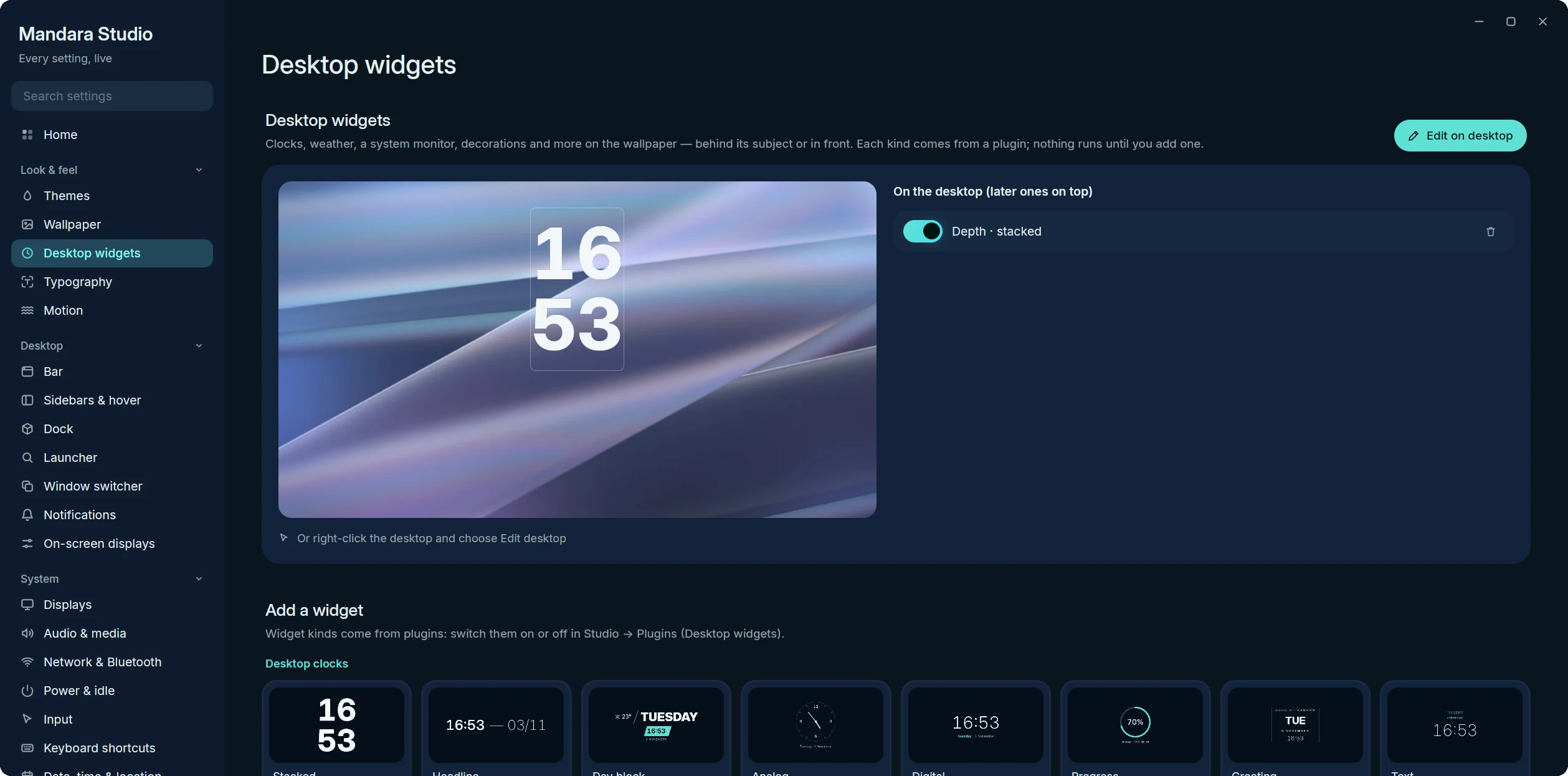 Desktop widgets: the preview, your widgets and the gallery |
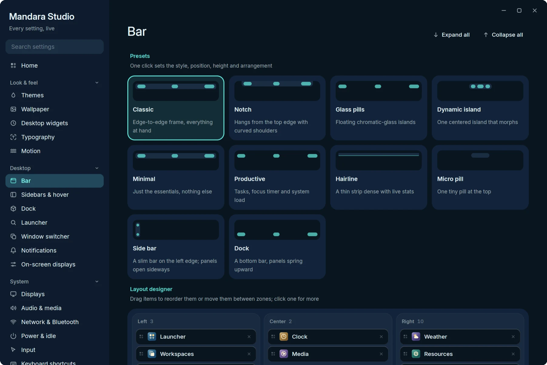 Bar: shape, appearance and item capsules |
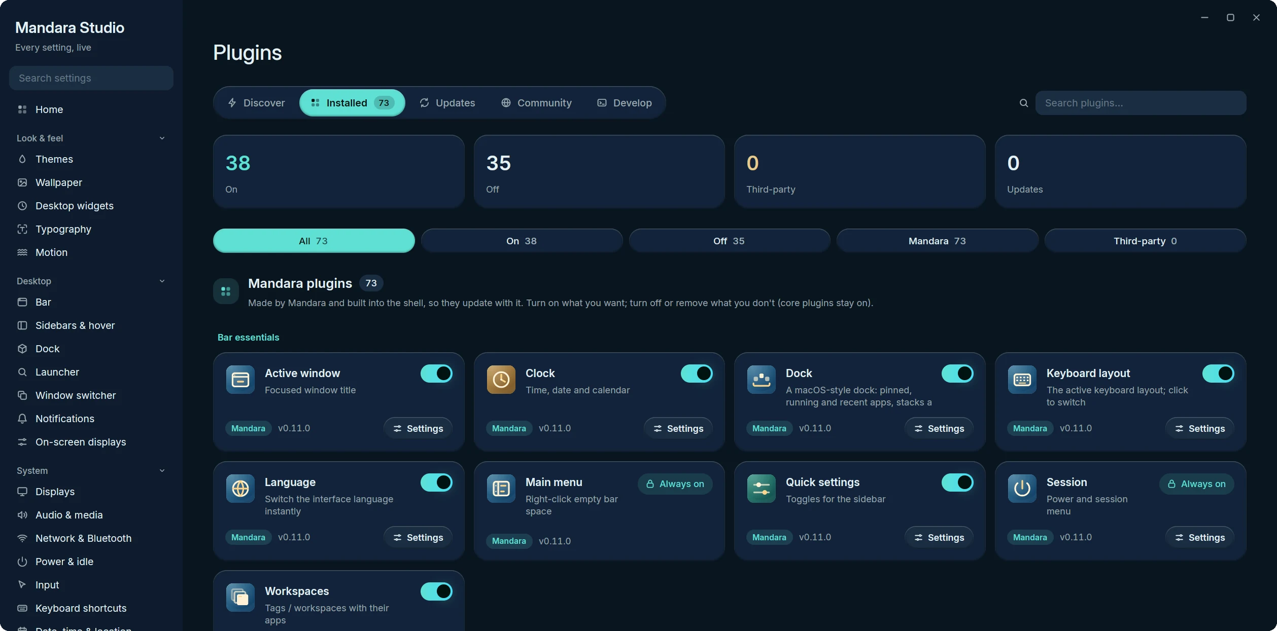 Plugins → Installed |
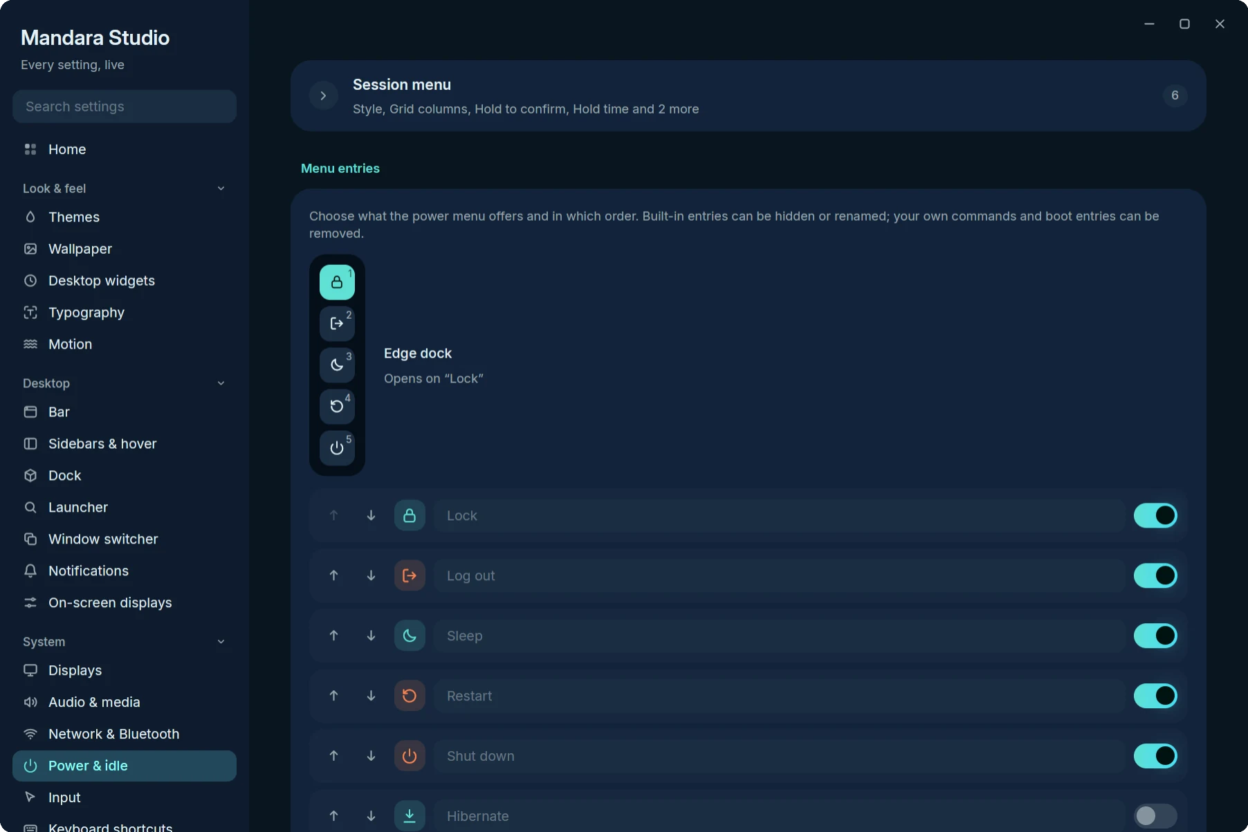 Power & idle: the session menu editor |
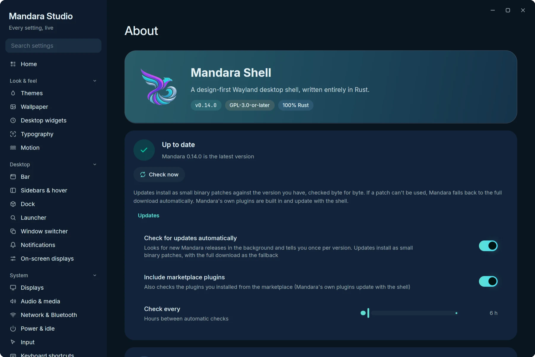 About: version and binary-patch updates |
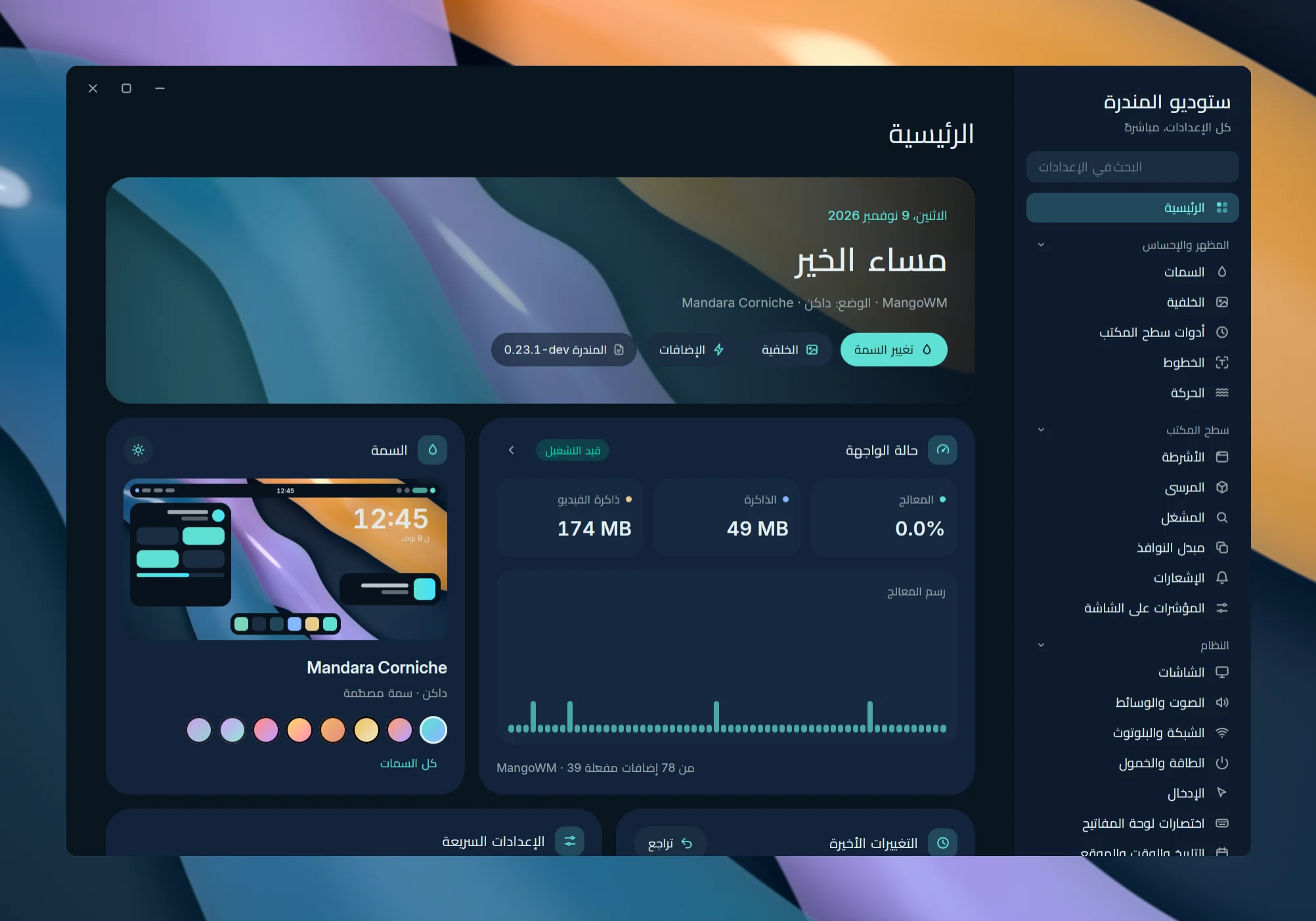 العربية: every page mirrored right to left, «ستوديو المندرة» |
|
Every setting is live: drag a slider and the bar changes on the very next frame. The slider’s handle and its value bubble follow the pointer on the next frame; the setting is applied at most once a frame and saved to disk once it rests. Changes that make the compositor re-tile your windows (the bar’s height and the space it reserves, compositor gaps and borders) wait until the slider rests, so windows move once instead of on every step. Studio opens on Home, a widget dashboard (a greeting over your wallpaper, live shell CPU / memory / VRAM, the theme with one-click switching, quick toggles, recent changes with Undo, and a card per group), and its sidebar groups 30 pages into Look & feel, Desktop, System, Security & accounts, Extend and Mandara: collapsible, searchable across every setting, keyboard-driven (Ctrl+F, Alt+↑/↓) and mirrored for Arabic, Persian and Urdu. Every page is responsive, from an icon rail and one column to ultra-wide.
- Look & feel: appearance and palette tuning, themes with live mock-ups, cursor themes (download, preview, apply), wallpaper (per display, light / dark, slideshow, depth clock), typography, motion (spring tuning, reduce motion).
- Desktop: a drag-and-drop layout designer with one-click presets, bar behaviour, sidebar and hot corners, dock, launcher, Alt-Tab switcher, notifications (rules, quiet hours) and on-screen displays.
- System: displays and night light, audio (per-app mixer and outputs, device names, shell sounds), network (VPN, hotspot, saved networks, static IP) and Bluetooth pairing, power and idle (timeouts, battery alerts, power-menu editor, event hooks), input devices, keyboard shortcuts with conflict detection, date / time / location and calendars, default and startup apps.
- Security & accounts: users (AccountsService, photos, passwords), Mandara Login with a live preview, the lock screen’s look, privacy indicators and offline mode.
- Extend: a plugin store (featured hero, curated shelves, search,
one-click Get / On, product pages, installed library, updates, the GitHub
marketplace, a local authoring handbook and validator, per-plugin settings) and compositor control for
MangoWM, Niri, Hyprland, Umbriel, Sway and River written to
~/.config/mandara/generated/*(sent over River’s protocol on River); your own config only gets one include line (with a backup). - Mandara: language, profiles with undo / export / import, performance, maintenance (health checks, repair, factory reset) and about.
Open any page directly: mandara studio displays,
mandara studio plugins --plugin weather --settings.
Bars combines the former Bar and Sidebars & hover pages. Its tabs are
Bar, Side bars, Sidebar, Drop-down panels, and Edges & corners. Open one
directly with mandara studio bars --tab sidebar or
mandara msg studio bars/side-bars. The older mandara studio bar and
mandara studio sidebar shortcuts still open the corresponding tab.
The configuration keys and saved bar profiles keep their existing format.
Studio uses the window it gets. On wide windows pages grow (up to about 1840 px), card grids gain columns, a page’s settings groups sit in two columns, and filter chips spread over the width in even rows; on narrow windows the chips become a strip you scroll with the wheel, a drag or its arrows. Text keeps a comfortable line length either way.
Navigation
The sidebar starts with Home, then groups every page by what it shapes.
Groups collapse with a click on their header; Studio remembers which ones
you closed in $XDG_STATE_HOME/mandara/studio-ui.toml (not in
config.toml, so it isn’t synced, exported or reset with your settings).
A collapsed group still shows the page you’re on. The list is compact
enough to fit with every group open on a 1440 px tall screen, and it
scrolls when it doesn’t. Every scrolling area (the sidebar, the page, long
lists and dialogs) has a slim overlay scroll bar on its end edge: it shows
while you scroll or point at the edge, widens under the pointer, can be
dragged or clicked to jump, and fades out after a moment (at once with
reduced motion). Under 900 px of window width it becomes an icon
rail. In Arabic, Persian and Urdu the whole frame mirrors: the sidebar moves to the right and
chevrons point the other way.
Sections
Every page is a short list of collapsible sections: related settings sit
together (the bar’s spacing, its screen frame, how panels animate; a
popup’s look and what it shows). A closed section shows a one-line preview
of what’s inside and how many settings it holds, or how many you’ve
changed, and its Reset works without opening it. The first settings
section on a page starts open; the long extras (designed themes, the tag
studio, each display’s shell surfaces, sound previews) start closed.
Expand all / Collapse all sit next to the title of pages with
several sections, search results open everything, and Studio remembers
what you opened per page (in the same studio-ui.toml).
Search (top of the sidebar) looks through every setting of every page, in English and in your language, and also finds pages by topic (“vpn”, “cursor”, “autostart”). While you search, every group opens, each page shows how many of its settings match, and pages without matches fade.
Keyboard
| Keys | Action |
|---|---|
| Ctrl+F · Ctrl+K | Focus search |
| Alt+↑ / Alt+↓ · Ctrl+PgUp / Ctrl+PgDn | Previous / next page, from anywhere |
| Ctrl+L | Focus the sidebar |
| ↑ / ↓ (sidebar focused) | Previous / next page |
| Home / End (sidebar focused) | Home / last page |
| ← / → (sidebar focused; mirrored in RTL) | Collapse / expand the current group |
| Enter · Space (sidebar focused) | Toggle the current group |
| Esc (sidebar focused) | Leave the sidebar |
Pages
Home
The landing page, laid out like a widget dashboard:
- Greeting — good morning / afternoon / evening and today’s date over your live wallpaper with an accent wash, the theme, mode and compositor, the version, and shortcuts to Themes, Wallpaper and Plugins.
- Shell status — running or not, live CPU (with the last minute as a sparkline), memory and video memory, sampled once a second only while Home is on screen, plus the compositor and how many plugins are on. The arrow opens Performance.
- Theme — a live mock of the shell in the current palette over your wallpaper, a sun / moon button that flips light and dark, and swatches of the designed themes: one click switches. All themes opens Themes.
- Quick settings — light / dark and bar style as choices, then night light, reduce motion and high contrast as tiles (the whole tile flips it; a tile that can’t apply in your setup says why).
- Recent changes — the newest edits made in Studio with how long ago and an Undo, the number of saved profiles and shortcuts to Profiles & backup.
- Browse settings — a card per group with its icon, summary and a pill for each of its pages.
The two rows of widgets sit side by side on wide windows and stack on narrow ones; everything mirrors for right-to-left languages.
Look & feel
| Page | What it covers |
|---|---|
| Themes | Every color and shape choice on one page, laid out like a theme store, in two tabs. Colors & style (the first) opens with a live preview: a large mock of the shell (bar, desktop clock, a panel, a media card and the dock) in the current palette over your wallpaper, beside the theme’s name and description, its palette strip, the text contrast ratio and the light / dark switch. Then Looks: six original one-click looks (Corniche Dusk, Pharos Ink, Montaza Crimson, Qaitbay Forest, Anfushi Wave, Night Frame), each bringing its own component designs (named on the Look, e.g. Expressive components, unless Keep my component designs when changing looks is on in the Components tab) as a compact list — a swatch of the look’s palette, its name in its own display face and one line, the current one checked, a live mock of it on hover — or, with Show previews, as big cards with that mock (Studio remembers the choice in studio-ui.toml); a click sets bar style, desktop widgets and cards, colors, fonts and roundness together after saving your setup, Use my wallpaper’s colors keeps the look but takes the palette from your wallpaper, Restore my look brings your setup back (looks never touch the wallpaper). Then Designed themes: every built-in and user theme as a compact row (a swatch of its surface and accents, its name and description, the active one checked, a mock of the shell in it on hover), or with Show previews as cards with a mock in the current mode, the other mode inset in its corner, a palette strip and its description. Then Colors from your wallpaper: on / off, the wallpaper, its lead colors and every Material You scheme style drawn as the palette it would make. Then Other apps: the apps Mandara can theme as a grid of small tiles grouped into desktop toolkits (GTK, Qt, Kvantum, KDE), terminals (Ghostty, kitty, foot, Alacritty, WezTerm, tmux, Zellij), editors (Zed, Helix, Neovim) and apps (Fuzzel, btop, Firefox, Vesktop, Cava, Spicetify), each with a switch and a chevron that opens a card with where its theme goes and how to select it (Kvantum’s also holds Use the Kvantum theme). Every app is off until you switch it on: Mandara writes nothing to other apps before that, and switching one off takes back exactly what it changed and restores any file it replaced. Then Cursor (the opt-in Cursor themes plugin; off, a one-line card offers it; see Cursor themes below): your cursor drawn from its own files at its size, every cursor setting, and a gallery of the ten most popular ricing cursor themes to download, apply and remove. The Components tab (mandara studio themes/components) shows how the shell’s and Studio’s own controls look; Studio follows a change at once. Every design tile has the same size (the name on one line, its description clamped to three lines), and the previews are still pictures or the real controls with nothing kept alive between visits. At the top, Presets: Classic (the default), Material You, Expressive, Minimal and Brutalist soft, each a tile with a strip of its button, switch and meter; a click sets every component design at once (corner size, shadows, panel edges and the slider handle stay yours), and the one your designs match is marked In use. Then one card per component, each design drawn as the real control. Sliders shows the five designs of the thick volume, brightness and mixer sliders side by side, each drawn as a real slider you can drag to try (dragging never changes your setting; click a design’s card to use it): Classic (the default: the fill, a small gap, an upright handle, then the rest of the track ending in a dot), Continuous (one track with a short grip inside the fill’s end), Pill (a round knob on the fill’s end that stretches into a pill while held), Wavy (the classic layout with a gentle wave along the fill that flows while you drag, still with reduced motion) and Segmented (ten rounded steps). Under them sits Slider handle: Line for the upright handle between a slider’s fill and its track, or None for the fill’s rounded end alone; it shapes every thin slider and the Classic, Continuous and Wavy designs, and says so while Pill or Segmented is picked. Thin sliders (Studio’s rows and the shell’s settings sliders) always keep the classic look. Buttons (the panels’, sidebar’s and main menu’s text buttons, Studio’s buttons and the round icon buttons; filled buttons stay the main action): Classic pills, Square (12 px corners), Expressive (round at rest, the corners spring to 8 px while pressed and back), Cut (corners cut at 45°) and Elevated (a soft shadow that lifts on hover and settles while pressed; none while Shadows is off). Toggles (every switch, tray menus’ check boxes and radio buttons, Studio’s check boxes; flip the previews to try them): Classic, Material (an outlined track whose thumb grows and carries a check when on), Expressive (the thumb stretches as it slides, check boxes round into circles as they fill, the radio dot springs in) and Round. Text fields (every text field and the panels’ search boxes; the previews are real fields): Classic, Filled (small top corners and an underline that thickens in the accent colour while focused), Outlined (the outline thickens while focused and the hint floats up into it once the field is focused or holds text) and Pill. Chips and choices (Studio’s choices, the panels’ segmented controls and filter chips): Classic, Material (an outlined group with fine dividers, the chosen option tinted) and Connected (separate buttons a hair apart with small inner corners; the chosen one fills and rounds fully). Progress (the panels’ meters, progress rings, the OSD level, notification progress and Studio’s progress bars): Classic, Material (a gap after the fill and a stop dot at the end; rings get a gap between fill and track), Wavy (the fill as a still wave inside the bar’s own height, flat when nearly empty or full) and Segmented (ten steps, twelve on a ring). Card corners (Rounded, Asymmetric with large leading-top and trailing-bottom corners, Square, Squircle with smooth continuous corners, Cut; squircle and cut cards are drawn row by row and clip their contents to the rounded rectangle inside them) and Card style (Tonal, Raised on a soft shadow, Outlined) shape the cards in panels, the sidebar and Studio; Corner roundness under Fine-tune still sets their size. Springs follow the animation speed and stop with reduced motion, and everything mirrors in right-to-left languages. Below them, under Fine-tune: automatic light / dark and its schedule, palette tuning (accent vividness, hue, lightness, specular rim), theme crossfade, style (corner roundness, shadows, panel edges, backdrop dim), icons and high contrast. mandara studio appearance and mandara studio looks still open it. |
| Wallpaper | Opens on the Wallpaper tab, always: the wallpaper on your desktop shown large at its own shape, with its file name, resolution and aspect, size, folder (click to open it), its colours as the theme engine reads them (Use for my theme turns on Match colors) and quick actions (Change folder, Open folder, Surprise me, Show on the login screen). Below it, In this folder: every image and video in your wallpaper folder as a grid of cached thumbnails, decoded at the size they’re drawn and loaded one page at a time (it opens on the page with your wallpaper, which is marked Current). Click a wallpaper or move with the arrow keys, Home / End and Page Up / Down and press Enter to switch (with the desktop’s transition); filter by name; hover a tile and press + to add it to the slideshow playlist. The picker’s settings follow, and while the generator or Wallhaven plugins are off, one-line cards offer them. Slideshow: an on / off switch with the next change’s time (or why it’s paused), Previous and Next wallpaper, interval presets from 5 minutes to a day plus Custom (45, 90m, 2h, 1d, up to a week) and the order (shuffle without repeats, random, by name, newest first); then folds for the source (your wallpaper folder, another folder, all sub-folders, separate light- and dark-theme folders, or the playlist, shown as thumbnails with remove buttons), when to change (at login, pause during fullscreen / on battery / while locked, only between two times), the slideshow transition (the desktop’s, or fade / wipe / grow / none with its own length) and displays (the same wallpaper everywhere or a different one on each display). A fixed light or dark wallpaper, which would hide the slideshow in that mode, is pointed out with a button to clear it. Fit & effects: drawing the wallpaper, crossfade, fill mode and colour, transition, sharing with the login screen, light / dark wallpapers, video wallpapers (pause behind windows / on battery, frame-rate limit, first frame only) and the depth clock: the depth effect, how the subject is found (Hand-tuned or Model), the model’s automatic split or Clock depth slider, Download, Regenerate and Place the clock; any new wallpaper setting lands here unless another tab claims it. Generator (with the wallpaper generator plugin on): a large live preview of the recipe (re-rendered off the UI thread as you drag, the last picture kept until the next is ready), the seed (shuffle, lock, Surprise me), five clickable variations, light / dark, the size (1080p to 8K, ultrawide, portrait or Match display) and format (WebP, PNG, JPEG, each with its expected file size), Generate wallpaper and Generate loop (seconds, fps) with progress and cancel, then the result with Set as wallpaper, Show in folder and Remix. Below: a style gallery previewing your palette and seed, the palette tiles (curated, Match theme, Custom with 2–8 hex stops), Fine-tune sliders built from the engine’s parameters (the style’s own, then tone, light, texture and layout, each group with a reset), Recent generated files (Remix, Set, Delete twice to confirm) and the opt-in schedule (interval, what to make, still or loop, keep N, apply, next run). Online (with the opt-in Wallhaven plugin on): Browse in the picker, the default search and sort order; off, the picker has no Wallhaven source. mandara studio wallpaper --tab slideshow opens a tab directly. |
| Desktop widgets | Edit on desktop, then Widgets (clocks incl. the depth clock, system monitor, decorations, plane visualizer: add from the gallery, one tile per family of look-alike widgets, then pick its Style — a new widget starts in front of the wallpaper’s subject on a free spot, and a tile already on the desktop is ticked and selects it instead of adding a copy — drag on the live preview, style each one; repeats are numbered, Remove duplicates takes exact copies away) and Desktop cards & visualizers — now playing, calendar, glowing wave, framed bars, mirrored bars: on / off and where each sits (nine anchors; top or bottom edge for the strips); each lives on its own small surface only while it shows. mandara studio desktop-widgets opens it. |
| Typography | Interface, display, Arabic and monospace fonts, size and weight; a font per surface (bar, panels & plugins, desktop widgets, lock screen and its clock, Studio). Every font button opens a floating, searchable list of installed fonts, each in its own face, under the button (or above it near the bottom of the window) without moving anything around it: type to search, Up / Down, Page Up / Page Down, Home / End and Enter to pick, Esc or a click elsewhere to close; any typed name works too (Use “…”). |
| Motion | Spring presets, a replayable preview, stiffness, damping, mass, animation speed, intensity, system reduced-motion preference and per-surface transition speeds. |
Desktop
| Page | What it covers |
|---|---|
| Bars | Five tabs keep related controls together: Bar (presets, plugin layout, position, spacing, shape and appearance), Side bars (left/right plugin groups, pinning, shape and material), Sidebar (widget tabs and cards, layout, appearance and motion), Drop-down panels (main menu, panel geometry, material and animation), and Edges & corners (hover triggers, hot corners and rounded screen corners). |
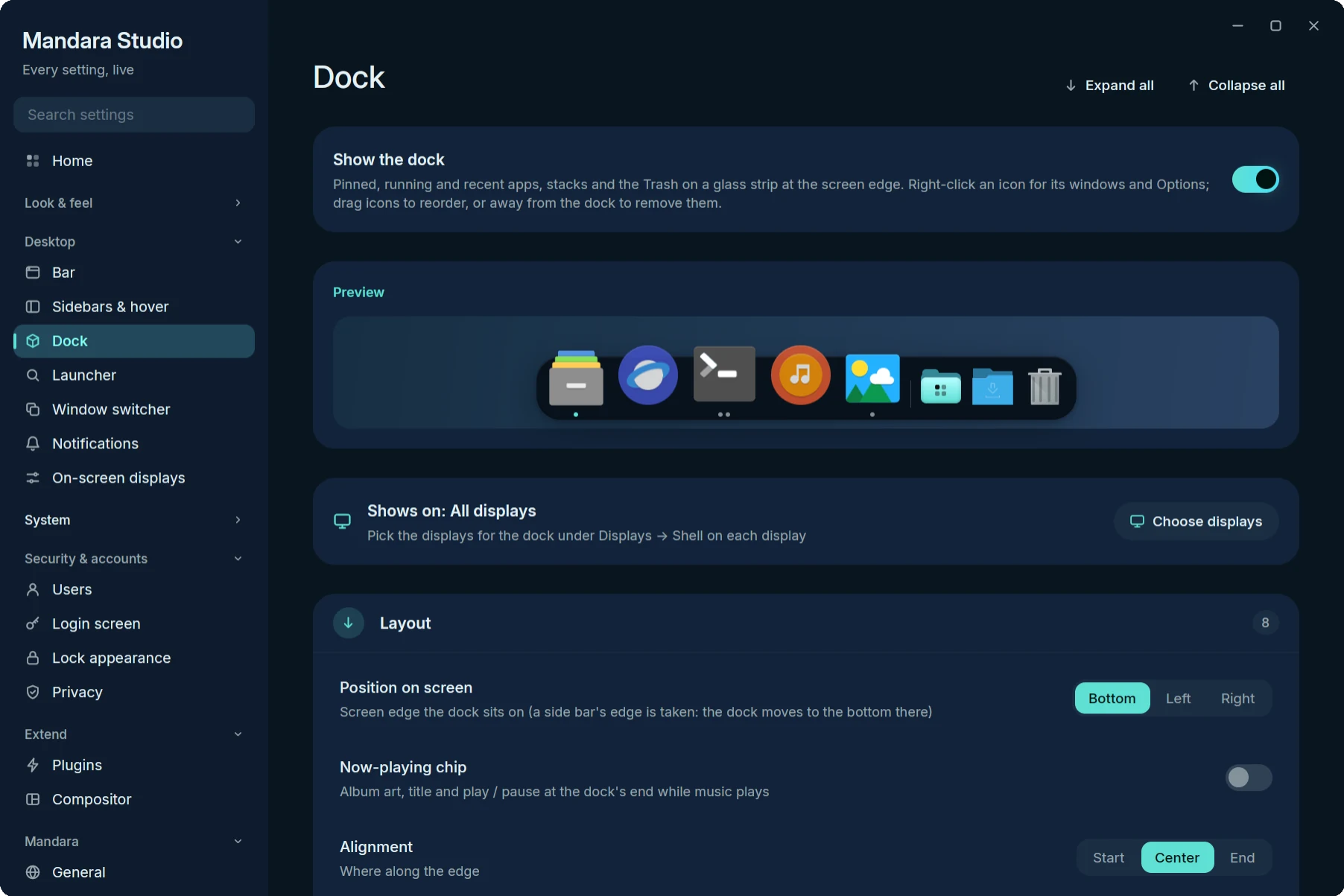
| Dock | A macOS-style dock. On / off (a hint and Show it now when auto-hide keeps it out of sight), live preview, then six groups with their own Reset: Layout (position, alignment, size, magnification and its size / spread, only this display’s windows), Behaviour (automatically hide and show — off / on / when a window overlaps — reveal and hide delays, slide speed, keep windows clear, above fullscreen, animate opening applications, bounce for attention, minimize windows into application icon, names on hover), Apps (the apps kept in the dock with icons: drag to reorder, × to remove, Add app… opens a searchable picker of installed apps with pinned ones checked; running apps, open-app indicators, recent apps and how many, notification badges, progress bars, window count, most apps, the launcher button — listed and dragged with the apps, Add the launcher brings it back —, the now-playing chip — album art, title and play / pause at the dock’s end while music plays), Applications folder (on / off — a folder on the right of the dock that opens a Launchpad-style grid of your apps, with search, category chips and a right-click menu, and installs apps dropped on it — view as Grid / List, order A–Z / Most used / Categories, icon size), Stacks & Trash (each folder with View as Automatic / Fan / Grid / List, Sort by date added / modified / name / kind, Display as Stack / Folder, add a folder; Trash, files per stack, files in a fan — Automatic always fans the newest that many files, however big the folder — and show file names) and Appearance (glass opacity and accent tint, corner radius, padding, icon spacing, distance from the edge, shadow, specular rim, separators, not-running opacity). Which displays show it is set under Displays. On the dock itself: right-click an icon for its windows, New Window and the app’s actions, Options ▸ Keep in Dock ✓ / Open at Login ✓ / Show in Files (and Uninstall… for apps Mandara installed), Show All Windows, Hide and Quit (Force Quit once a quit didn’t take, or with Alt held); right-click empty dock space for Add app…, Keep the launcher in the Dock, auto-hide and magnification; drag icons to reorder, a running app into the pinned ones to keep it, or away from the dock to remove it; drop files on an app to open them with it, on the Trash to trash them, and installable apps on the dock or the Applications folder to install them. Click a stack for its fan (the newest files on an arc that pops up out of the icon as one piece, names in pills, Open Downloads · N more (the folder in your file manager) at the top) or its grid (arrow keys, Enter, type to filter, right-click for Open / Show in Files / Move to Trash); the dock stays out while a stack, the Applications grid or a menu is open. |
| Launcher | Sections in setup order. Launcher looks: Classic, Grid and Beacon as three cards of exactly the same size (a miniature, the name, a two-to-three-line description and tags for the layout and placement), a click applies one; Preview opens the launcher. Placement: a small screen diagram with the bar along its edge and seven clickable spots — top left / middle / right, the center of the screen, bottom left / middle / right (the screen’s own sides, also in right-to-left languages) — the chosen one highlighted, a line on how it looks with your bar (grows out of the bar like its panels, a floating card under floating pills, or “the bar is on the other edge” when it opens from the bare screen edge; a note when the dock makes it float above the dock, click only), and Preview to open it, with Size & placement under it (align to the launcher button, search field, width / height when attached and in the center). Launcher button: its icon picker. Search & results: style, layout, visible results, app icons, the grid and the Beacon bar, providers and prefixes, ranking, and what the ranking has learnt. Behaviour: on / off, dim, keyboard only, remembering the last search, launch prefix and systemd scopes. Apps: pinned and hidden apps and your own names and icons. Then slash commands and skills. |
| Window switcher | Alt+Tab style and scope, previews, screen time. |
| Notifications | Popup placement, size and timeouts per urgency, rules per app, do not disturb and quiet hours, history limits. |
| On-screen displays | Every OSD kind, orientation, scale and offset. |
System
| Page | What it covers |
|---|---|
| Displays | Arrangement: the canvas, a card per display under it with two or more (also one that’s off), Apply / Reset with a keep-or-revert countdown, and the selected display’s power, resolution, refresh rate, scale, rotation and adaptive sync in aligned rows; Shell on each display (bar, dock, OSDs, launcher & pop-ups, notifications, wallpaper); Profiles as same-size cards (Apply, Delete, Connected), Save as profile, keep after restart and the revert / auto-profile settings; Monitor brightness (DDC/CI); Night light. |
| Audio & media | Per-app mixer and outputs, default devices (rename, hide), volume step and ceiling, ignored players, shell sounds, visualizer and lyrics. |
| Network & Bluetooth | Connection details, VPNs (WireGuard / OpenVPN import), hotspot with QR, saved networks, static IP / DNS; Bluetooth devices, pairing dialog, auto-connect, adapter. |
| Power & idle | Status, idle timeouts (mains / battery), lock behaviour, idle commands, battery alerts (the Power panel’s style, Classic or Modern, and the bar battery’s pulses: coral while critical, a gentle breath while charging) and profiles, the power menu editor (entries, style, and the dock’s Position: opposite the sidebar, left, right, top center or bottom center — at the top or bottom it hangs from the bar there, one piece with it in the edge-frame styles and a card next to a floating bar, or from the screen edge when the bar is elsewhere, which the preview says; the grid always opens in the middle, and so do the Cards, separate floating cards in a Row or a Column under Card layout, which locks the position with that reason), event hooks. |
| Input | Keyboard layouts and labels, repeat, Num Lock; mouse and touchpad; focus follows mouse. The cursor lives on Themes → Cursor (a card here links there). |
| Keyboard shortcuts | Mandara’s compositor binds with chord capture and conflict detection. Under Add a shortcut, choose a starting action, press the chord, then choose Program to enter any command. Existing compositor shortcuts are listed below and kept intact. |
| Date, time & location | The system clock (time zone with search, set time automatically, and a one-click fix when it doesn’t match your location’s time zone), clock and date formats, the calendar’s week numbers, weekend days, Hijri dates and Eastern Arabic numerals, calendar subscriptions and reminders, the shared location (weather and prayer times follow it unless they have their own), weather. |
| Applications | Installed apps (search, hide, rename, install from files by picker or drag and drop, uninstall with optional leftover cleanup), default apps, apps at login, how apps are launched. |
Security & accounts
| Page | What it covers |
|---|---|
| Users | AccountsService accounts: create, edit, delete, photos, passwords. |
| Login screen | Mandara Login (greetd greeter) with a live, draggable preview; beside it Apply to login screen, Preview full screen and Try it (entrance, typing, wrong password, success, idle clock). Tabs: Looks (six ready-made designs, Mandara, Midnight card, Material You, Ghostline, Chrome Halo and Meridian, three to a row, each with a miniature drawn from its own layout so the sign-in shows on its side), Layout, Background, Clock, Sign-in, Session, Theme, Motion; settings that depend on another one show only once it’s on. The Login manager tab to switch login screens (Mandara Login, other greetd greeters, SDDM, GDM, …): Use for an installed one, Install & use for one that isn’t (it installs the login manager or greeter with greetd, cage or LightDM’s greeter through the system’s package manager, after showing the plan). |
| Lock appearance | Clock style, background, avatar, media, weather, notifications, battery and its low-battery mark, OLED care. |
| Privacy | Microphone / camera / screen-share indicators, offline mode. |
Extend
AI Shell Agent configures offline natural language commands, downloads and verifies models, and provides a dry-run test bench. See Local shell commands.
| Page | What it covers |
|---|---|
| Plugins | A plugin store: Discover (featured hero, curated shelves, search with filter chips), Installed, Updates, Community (the GitHub marketplace) and Develop (the authoring handbook and validator); per-plugin product pages and settings modals, which hold each plugin’s own options (clipboard history, screenshot, weather, prayer times…) — including refresh intervals, how many rows a list shows and alert thresholds (Resources, Process hunter, Containers, Services, Drives, Network speed, Network, Clock, To-do, Bluetooth, Authenticator). To-do adds its default list, show completed, sort order and what the bar counts; Notes its default topic, the notes folder (point it at a synced folder or an Obsidian vault), preview by default and the editor font and size. Configuration lists every setting by page. Every Mandara plugin can be switched off (it then stops everything it runs: bar item, sidebar card, launcher entries, background polling) or removed from the detail modal: off, out of the bar and sidebar, and parked under Removed Mandara plugins (their store cards offer Add back) until Restore puts it back where it was. Core plugins (launcher, session menu, main menu) show Always on. The dock, mini stats, screen time and prayer times ship off. |
| Compositor | The Config doctor (your compositor’s own checker on your config: problems by file and line, explained, with reversible fixes), then MangoWM / Niri / Hyprland / Umbriel / Sway / River gaps, borders, rounding, blur, rules, tags, layouts; written to ~/.config/mandara/generated/. KWin uses native Plasma protocols; its compositor settings remain in Plasma System Settings and Studio explains the locked controls. |
Mandara
| Page | What it covers |
|---|---|
| General | Language (a language whose pack is missing downloads it: its card fills with the download, turns green with a check when it’s in, or red with the reason and Retry if it fails; see Languages), units, week start, polkit agent, lock routing, keyrings & passwords (GNOME Keyring prompts, KeePassXC dialog, unlock at login), restart after a crash. |
| Profiles & backup | Recent changes with undo, named profiles, export / import, reset a page, support report. |
| Performance | The shell’s own CPU, memory and threads, Studio’s separately, frame-time diagnostics, restart / quit. |
| Maintenance | Health checks with repair, downloads, cache cleanup, backups, factory reset. |
| About | Mandara updates (binary patch first, full download as the fallback; marketplace plugin updates), version, compositor, theme, config path. |
In depth
- Desktop widgets (Wallpaper): a scaled preview of the display — the
wallpaper’s thumbnail with every widget drawn by the shell’s own
software painters — above a gallery that adds a clock (live
thumbnails), the system monitor, a visualizer shape or a decoration
preset (Alexandria line, Vertical poem with placeholder text to
replace, Geometric set). Look-alike widgets share one tile: the clocks
are Stacked (superscript, stacked card, framed HUD), Headline, Day
block, Analog (classic, cookie, orbit, hands over numerals),
Digital (clock, ring, time in a shape, dot matrix, pixel, digit boxes,
slanted HUD), Progress (day ring, wavy week, month bar, year in
dots), Greeting and Text (text lines, divided text, day numeral),
plus the depth clock; the monitors are System monitor (column,
gauges, meters, bars, wavy gauges) and Thermals. A tile adds the
family’s first style, and the widget’s Style row (a small picture
of each) switches it to another one in place: it keeps its spot, size
and displays and the colours, font and digits you chose, unless the
style sets them itself. A widget you changed since shows its closest
style marked changed. Drag a widget on the preview to move it; on
release it re-anchors to the nearest of nine anchors and keeps its
place. Select a widget (preview or list) to edit its depth (behind the
subject or in front), anchor, offsets, size, opacity and displays, and
its own settings: clock style, seconds, numerals, weather; monitor
readings (CPU, CPU graph, GPU, VRAM, memory, swap, GPU power, CPU and GPU
temperature, fan, battery, disk, download, upload and the network graph,
each switched on or off; a GPU reading the machine can’t show is locked
with the reason), refresh and width; decoration text, size, weight, letter spacing, shape
and rotation; visualizer shape, bars, length, height, angle, gap, frame
rate and silence stop; font, colours (automatic, text, accent or a
custom
#rrggbb/oklch(L C H)) and shadow / glow. The switch on each chip turns a widget off without losing it. Every edit reaches the shell at once. Nothing runs while the list is empty. - Layout designer (Bar): the bar’s Left / Center / Right zones (Top / Middle / Bottom when the bar stands on a side edge) are columns with their plugins stacked in order, side by side on a wide window and one under the other on a narrow one; while side bars are on, their top / middle / bottom groups flank the screen under them. Drag an item to reorder it or move it to another zone, × takes it off, and a click opens a menu: Move up, Move down, Move to …, Remove from bar and Details. Under the zones, All plugins lists every plugin that can sit on the bar in an aligned grid. Desktop-only widgets belong in the Desktop widgets gallery. The bar items are grouped by category (a category list beside the grid on wide windows, chips above it on narrow ones; faith plugins have their own Faith category), with a search field that filters as you type (names and ids that hold what you typed first, name starts ahead of the rest; a fuzzy match for typos when nothing does; then the category and description). Plugins on the bar show their zone, plugins that are off say so. Click one for Add to Left / Center / Right (and the side bars while they’re on) or Details, or drag it onto a zone; placing a plugin turns it on, and dropping a bar item on the list takes it off the bar. The chosen bar preset stays highlighted when you keep your own items. Manual item, layout or position changes clear that selection. Bar presets (System monitor, Classic, Notch, Glass pills, Dynamic island, Minimal, Productive, Hairline, Micro pill, Side bar, Dock, and the style presets Expressive, Tile dock, Rail, Segmented, Stanley Bridge, Pharos Beam and Raml Tram) apply the style in one click and keep your items; each card draws its bar in miniature. System monitor is a style of its own: a slim bottom status line of stat blocks in the monospace font. Productive is a work desk along the bottom edge: the focus timer and the window you’re in sit in the middle, to-dos and notes on the left, system load and the clock on the right, each zone on a soft capsule of its own. Turn on Replace bar items to use the preset’s arrangement too. Profiles & backup → Bar saves only the bar and side-bar configuration, leaving the theme and desktop widgets alone.
- Radii, per bar style. Bar radius rounds the glass pills and the island; on the edge frame it rounds the hover chips (and the frame’s ends when Float the edge frame is on). Flare radius is the concave curve where the edge frame meets the screen sides, panels and the sidebar. Panel radius rounds drop-down panels; Corner radius (Bars → Sidebar) rounds floating or non-edge-frame side panels and the power dock. Themes → Corner roundness multiplies every one of them and every card, chip, button and row radius in the shell (0 = square, 2 = extra round); nested corners stay concentric (inner radius = outer − padding, never below 0).
- Controls that don’t apply to the current setup (flares without the edge frame, rims and shadows on the flush edge frame, a margin while side panels are flush, spring values while Custom spring is off) show why in place of their control.
- Reset next to a group’s title restores that group’s defaults; it appears once something in the group differs from them.
- Everything is live: the bar, open panels, the sidebar, the launcher, OSDs and the dock redraw in place on every edit, without reopening.
-
Compositor control for MangoWM, Niri, Hyprland, Umbriel, Sway and River: gaps, borders, rounding, blur, shadows, opacity, window rules and keybinds, one-click window-look presets and common window rules, gaps that follow the bar, and Hyprland’s layout (dwindle / master), border resizing and group tabs. Changes go to
~/.config/mandara/generated/*, and your own config only gets one include line (with a backup), appended at the end so Mandara’s values win:Include line Autostart (drop-in) MangoWM source_optional=~/.config/mandara/generated/mango.confexec_once=/abs/path/mandaraNiri include optional=true "/home/you/.config/mandara/generated/niri.kdl"(plainincludebefore 26.04)spawn-at-startup "/abs/path/mandara"Hyprland ≤ 0.56 source = ~/.config/mandara/generated/hyprland.confexec-once = /abs/path/mandaraHyprland 0.57+ (Lua only) pcall(dofile, "/home/you/.config/mandara/generated/hyprland.lua")inhyprland.luahl.on("hyprland.start", …)Umbriel "/home/you/.config/mandara/generated/umbriel.toml"in[include.optional] files(added to your list if you have one)general.autostart = ["/abs/path/mandara"]Sway include /home/you/.config/mandara/generated/sway.confexec /abs/path/mandaraRiver none (Mandara never edits init; its settings go overriver-control)riverctl spawn /abs/path/mandara, a line you add toinitThe dialect follows the installed version (
niri --version,Hyprland --version); each compositor’s own checker (mango -p,niri validate,Hyprland --verify-config,umbriel config validate,sway --validate) must accept the result or the include is rolled back. Sway has no rounded corners, blur, shadows or animations, and no opacity rules that Mandara supports (itsopacitycommand isn’t a rule): while it runs those rows are locked with that reason, and its tab says what its drop-in carries (gaps, pixel borders,client.*colours,for_windowfloating / sticky rules for both Waylandapp_ids and X11 classes,input/seatsettings,outputlines andbindsymkeys). River’s tab says how its settings travel and shows the line to add toinit; gaps (including Gaps follow the bar), rounded corners, opacity, blur, shadows and animations are locked there. Umbriel is the exception to “Mandara’s values win”: it applies yourconfig.tomlafter its includes, so what you set there wins (rules from both files are kept), and the Umbriel tab says so. On Niri the drop-in also makes workspace backgrounds transparent: Mandara’s wallpaper lives in Niri’s Overview backdrop and would otherwise only show there. On Hyprland 0.57 Mandara’s workspace clicks and other dispatches are sent as Lua (hl.dsp.focus({ workspace = 3 }));mandara msg compositor dispatchtranslates the common hyprlang dispatchers and passeshl.…text through. - Config doctor (top of the Compositor page): the compositor’s own
checker (
mango -p,niri validate,Hyprland --verify-config,umbriel config validate,sway --validate --verbose, whose verbose output is what reports a key bound twice) run read-only on your config and every file it includes, with its verdict in one line (“All good — checked 2 min ago with MangoWM 0.18.4”). Problems are grouped by file, your files apart from Mandara’s drop-in, each with its kind (unknown, removed in this update, deprecated, syntax error, invalid value, duplicate keybind, missing file, not supported by this version), the line itself, a plain-language explanation and the compositor’s own message. Fixes: Open in editor at that line, Comment out or Remove line (backup first, checked again, undone automatically if it made things worse) and Regenerate for the drop-in (an option this version rejects is left out for it from then on). Check again re-runs it; Remind me later quiets the start-up notification until the config or the compositor changes. The same ismandara msg compositor check/fix, andmandara setup --check/--fixwithout a running shell (see install). - Notifications, On-screen displays, Privacy: popup placement (or joined to the bar) and timeouts per urgency, a rules editor with one-click rules for recent apps, quiet modes, history limits; every OSD kind; indicator ignore lists.
- Audio & media: per-app mixer (the row of the player the media panel follows sets that player’s own volume when it allows it, as in the shell), default devices you can rename and hide, per-app outputs (calls to the headset, music to speakers), volume step and 100 % / 150 % ceiling, ignored media players, shell sounds with previews.
- Displays: drag monitors on an arrangement canvas (edges snap), pick
resolution, refresh rate, scale, rotation, adaptive sync and on / off over
wlr-output-management(MangoWM, Niri, Hyprland). Every change applies with a 15-second “Keep or revert” countdown; saved profiles switch automatically when the same monitors are plugged in (matched by EDID make / model / serial), and Keep after restart writes monitor lines to the compositor drop-in. Shell on each display chooses where the bar, dock, OSDs, notifications and wallpaper appear (all, the main display, or a list); the Bar and Dock pages link there. Launcher & pop-ups (the launcher, Alt+Tab, the app installer and password prompts) open on the display you’re on when it is allowed, else on the main display; until set, the row follows On-screen displays. External monitor brightness works over DDC/CI (pure Rust,/dev/i2c-*, needs thei2cgroup). - Night light: warm screens from sunset to sunrise (your location),
fixed times or always, with eased transitions, gamma and night dimming,
and pauses for fullscreen windows or chosen apps. Pure-Rust
wlr-gamma-control(MangoWM, Hyprland, Sway, and Niri on a real tty session — a nested Niri has no gamma, and the tile says so), also a quick-settings tile andmandara msg nightlight toggle. When a screen refuses the warmer colours (another night-light app such as wlsunset holds them, or the driver won’t), a notification says so and names the app it finds. - Plugins: a plugin store with five places and one search. Discover
is the store front: a featured hero that rotates through the plugins’
cover art (paused under the pointer, stopped whenever Studio or the tab
isn’t on screen), filter chips, and curated shelves built from the
categories — Essentials, For your desk, Productivity, Media &
capture, System tools — plus New & updated and Community picks
when there are any, each with See all. Every card has its cover art,
name, one-line pitch, a Mandara / third-party badge and a one-click
Get / On button that shows its state (off, on, removed → Add back,
update available → Update, core → Always on). Installed is the
library: on / off / third-party / updates counts, filter chips, grouped
cards with switches and Settings, and the removed built-ins with
Restore. Updates checks and applies marketplace plugin updates,
one by one or all at once. Community is the GitHub marketplace as
store cards (Get, Update, Remove); while it is empty or out of reach it
suggests Mandara plugins you haven’t switched on. Develop is the
authoring handbook, built from your system: your real plugin folders (state,
counts, precedence), the folder and
plugin.tomlformat, the sandbox architecture with its real time budgets, the WIT contract, copyable quick-start commands, and a validator that lists every local plugin with its load status and actual error, and can test-load one. Click a plugin for its product page: a hero over its blurred cover with the icon, name, maker, Get / On and Settings; an info strip (category, version, access, where it fits); the cover art with More like this; the full description; What’s new when an update waits; what it may access (network, D-Bus services, files, compositor, …); its settings; the bar zones it fits with add to bar or sidebar; and remove / restore / uninstall. Cover art is decoded off the UI thread at the size it is drawn, only for cards on screen. Its settings modal gathers every setting it owns, from its own options to the shell sections it drives (Weather: place, units, animation; Prayer times: location, method, Asr school, Hijri adjustment; Screenshot: copy, save, timer, countdown, text recognition, toolbar position and size, and the screen recorder: which recorder (with the installed ones and what each supports), source, display, countdown, resolution, frame rate, codec, quality, format, sound and devices, folder and file name; choices the recorder in use can’t do are greyed out with the reason), including the[[settings]]a third-party plugin declares. - Users: create, edit and delete accounts through AccountsService:
full name, e-mail, language, administrator or standard, automatic login,
locking, and passwords (strength meter, hashed with SHA-512 crypt in pure
Rust, or “choose at first login”). Profile photos are cropped from any
image (zoom, drag to position) or picked from procedural Mandara presets;
the lock screen and Mandara Login show the same photo. You can’t delete
yourself or the last administrator, and polkit asks for a password when
it’s needed. Try it safely with fictional accounts:
mandara studio users --demo. - Network & Bluetooth: connection details (addresses, gateway, DNS,
MAC, speed); VPNs with a connect switch, plus importing WireGuard
.conf/ OpenVPN.ovpnfiles into NetworkManager (.ovpnneeds NetworkManager’s OpenVPN plugin, which the installer offers); a Wi-Fi hotspot with a QR code phones scan to join; saved networks (auto-join, priority, forget, static IP / DNS, hidden networks); Bluetooth devices with battery, trust, rename, forget and pairing through Mandara’s own pairing dialog (org.bluez.Agent1: passkey compare, PIN, authorize), trusted devices reconnecting on power-on, adapter choice and connection notifications. - Cursor themes (Themes → Cursor,
mandara studio themes/cursor; the opt-incursorsplugin — switched off, Mandara writes no cursor setting anywhere, applies none live and leaves~/.icons/defaultalone):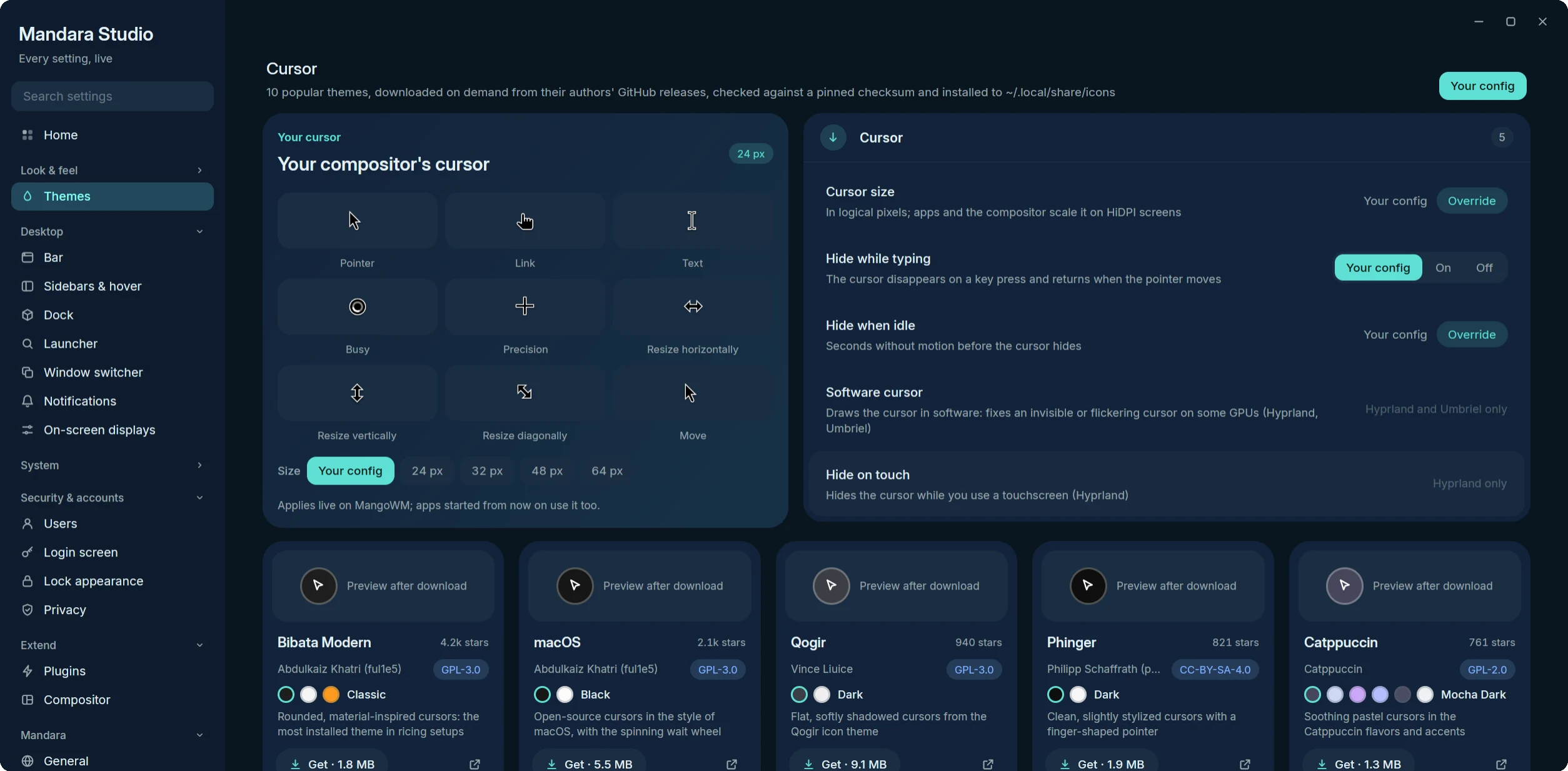
- Your cursor draws the applied theme from its own XCursor files — pointer, link, text, busy, precision, the three resizes and move — at the chosen size, with 24 / 32 / 48 / 64 px chips beside the size slider. The rows next to it: Hide while typing, Hide when idle (MangoWM, Niri, Hyprland, Umbriel, Sway, River), Software cursor (Hyprland and Umbriel) and Hide on touch (Hyprland only); where a compositor lacks one, the row says so in place of the control.
- The gallery: Bibata Modern, macOS, Qogir, Phinger, Catppuccin, BreezeX, Vimix, Banana, Nordzy and Rosé Pine — the ten most-starred themes that publish ready-built cursors on GitHub. Each card shows a preview strip (or a swatch and “Preview after download”), author, licence, GitHub stars, its variants as dots and one action that follows its state: Get · size → Installing n % · Cancel (a progress bar) → Apply → Active, plus Remove (press twice) for what Mandara installed. A failed download shows its error on the card with Retry. Tab moves between cards, Enter / Space runs the action, ← / → pick a variant (mirrored right-to-left) and Delete removes.
- Installing downloads the pinned release file from the theme’s own
GitHub repository, checks its size and SHA-256, unpacks it with
pure-Rust readers (gzip, xz, bzip2, zip; paths leaving the folder are
refused, links pointing outside it dropped) and moves only the theme
folder (
index.theme+cursors/) to~/.local/share/icons/<Theme>. Nothing from the archive is run.~/.local/share/mandara/cursor-themes.jsonrecords what Mandara installed: a theme folder you or a package put there is never replaced or removed. Nothing is bundled in the binary. - Applying writes the drop-in (
cursor_theme/cursor_size+env=XCURSOR_*for MangoWM,cursor { xcursor-theme … }for Niri,env = XCURSOR_* / HYPRCURSOR_*+cursor {}and a livesetcursorfor Hyprland,[input.cursor]for Umbriel,seat * xcursor_themeand a liveseatcommand for Sway,xcursor-themefor River) and reloads the compositor, so the cursor changes at once. X11 and older toolkit apps follow through~/.icons/default/index.theme, created only when you have none and removed again when you go back to “Your config”. - Also installed lists the other cursor themes on the system.
- Input: keyboard layouts (search, variants, order, switch shortcut,
short bar labels like EN / ع), repeat delay / rate, Num Lock, mouse and
touchpad (acceleration, speed, natural scrolling, tap-to-click, drag
lock, disable while typing, scroll and click method, left-handed),
focus follows the pointer.
Written to the compositor drop-in (
mango.conf,niri.kdlinput {}, Hyprlandinput {}/hl.config({ input = … }), Umbriel[input.*], Swayinput type:keyboard|pointer|touchpad …andseat * …, Riverkeyboard-layout,set-repeatandinput pointer-*|*Touchpad* …commands); “Your config” keeps your own value. On Niri a touchpad or mouse setting replaces your wholetouchpad {}/mouse {}block (Niri merges those blocks as a unit), and “focus follows the pointer: off” can’t be set from an include — removefocus-follows-mousefrom yourconfig.kdlinstead. - Applications, in four tabs (the last one is remembered):
- Installed: every app with a launcher entry as a searchable card
grid with its icon and where it came from (Pacman, APT, DNF, Zypper,
XBPS, APK, Portage, eopkg, Nix, Flatpak, Snap, AppImage, Local), with
source filters. Each card opens the app, hides it from the launcher,
renames it there (
[launcher] hidden/overrides) or uninstalls it. Uninstall asks the app’s own package manager who owns it (detected at runtime, no distro assumed) and shows a confirmation with the exact command (system packages run throughpkexec, neversudoor a shell), what else the package manager would remove (from its own dry run), refusals (the shell, compositor, portals, core system packages, NixOS-declared apps) and an extra confirmation for your default terminal / browser / file manager. Optional cleanup lists leftovers in your home folder (~/.config,~/.local/share,~/.local/state,~/.cache,~/.var/app/<id>,~/snap/<name>) matched by the app’s exact id, program, window class or package name, each with its size and unchecked; ticked ones move to the Trash (freedesktop spec, with.trashinfo), nothing is ever deleted. AppImages and local entries go to the Trash too.MANDARA_UNINSTALL_DRY_RUN=1turns every uninstall into a dry run. The tab opens on a drop card (“Drop an app here, or choose a file”, with the supported formats); Choose a file… / Install app… open the desktop portal’s file picker (filtered to AppImage, Flatpak,.tar.gz/.tar.xz/.tar.zst/.zip,.deb,.rpm,.pkg.tar.zst,.apk,.xbps), and files dragged onto the tab from any file manager glow “Drop to install”; either hands them to the shell’s App installer (the list refreshes when the job finishes). Its on-screen sheet shows the app’s icon large, name, version and developer, summary, chips (the format — hover it for what that means in plain words — size as file / installed, categories), up to three screenshots shipped inside the file (never downloaded), the description, where it installs, the PATH command switch, a Flatpak bundle’s permissions as friendly rows (network, files, devices, sound, system services — broad ones in amber), a native package’s dependencies (collapsible) with a clear Needs your password row, warnings (wrong architecture, an older version than installed, package-manager conflicts) and, when the app is already there, Update / Reinstall / Keep both with installed vs new version. Several files dropped at once open a queue sheet (each file’s status; Install all, Review each, or Review one). Installing shows a pill with a smooth progress ring, the steps (Inspecting → Installing → Adding to apps → Done) and elapsed time; it ends with the icon’s bounce and a check, Open, a Keep in Dock switch (on when installed from the dock) and Show in Applications — or a failure card with a plain explanation, a fix where one exists (Try again, Open settings, Find it on Flathub), Show file and the technical detail behind a disclosure. Enter runs the highlighted action, Tab moves between actions, Escape cancels or closes. The Installed by Mandara chip lists what the installer put in place, newest first, with the source file, date and size, and Show in Files / Uninstall…. Apps it installed carry a Mandara source badge and uninstall exactly the files it recorded (~/.local/share/mandara/apps/registry.toml), to the Trash. Its settings — install location, Add to PATH by default, confirm before rootless installs, Flatpak for you or everyone, allow native packages, keep or trash the original file, notify when done — are under Plugins → App installer. - Defaults: default apps per kind of file or link (edits only those
keys of
~/.config/mimeapps.list) and the terminal / file manager / browser Mandara opens. - Startup: apps and commands at login (XDG autostart; disabling only
sets
Hidden=) and Mandara’s own autostart runner. - Launching: launch prefix (
uwsm app --), a systemd scope per app, the terminal for terminal apps (the same settings as Launcher → Starting apps; it falls back to the preferred terminal), a live example, and window → app matches for icons.
- Installed: every app with a launcher entry as a searchable card
grid with its icon and where it came from (Pacman, APT, DNF, Zypper,
XBPS, APK, Portage, eopkg, Nix, Flatpak, Snap, AppImage, Local), with
source filters. Each card opens the app, hides it from the launcher,
renames it there (
- Security / Keyrings & passwords (General): Authentication dialogs is Mandara’s polkit
agent; GNOME Keyring prompts makes Mandara gnome-keyring’s system
prompter (
org.gnome.keyring.SystemPrompter), so unlocking a keyring, choosing a new keyring’s password or confirming unencrypted storage opens a Mandara dialog instead ofgcr-prompter’s GTK window. The password reaches gnome-keyring through gcr’s encrypted secret exchange (DH + AES), never in clear text on the bus. Both follow the switch live, and both step aside when another agent or prompter (GNOME Shell) is already running. Preview withmandara msg keyring-prompt demo(create,confirm). KeePassXC unlock dialog (on by default; the quick-settings tile and launcher entry appear only when KeePassXC is installed) types a KeePassXC database password in Mandara’s style; its help text says the password reaches KeePassXC in clear text on the session bus (readable only by your own programs). Ask for KeePassXC at login opens it once per login when KeePassXC runs with a locked database. KWallet’s own dialog can’t be replaced (its D-Bus API takes no password), so the Unlock at login card below shows whether GNOME Keyring and KWallet open with your login password through Mandara Login’s PAM stack, with Set up / Remove (thegreeter keyring-unlockplan first, thenpkexec … --applythrough the root-owned admin helper, never your own copy;MANDARA_GREETER_DRY_RUN=1keeps it plan-only), and KeePassXC’s state with Unlock now. - Profiles & backup: recent changes with undo, named profiles (look only, or everything), export (only what changed, personal values redacted) and import, reset any page to defaults, and a redacted support report.
- Maintenance: health checks with one-click repair, model and font downloads, cache cleanup, backups and factory reset. Its icon-theme check flags a missing selected theme; Themes opens Themes → Icons so you can choose another. Repair all leaves that choice alone.
- Performance: the shell’s own CPU, RAM and threads, and a supervisor you can turn off.
Mandara updates (About)
The update card at the top of About is how Mandara updates itself. It shows your version and either “Up to date” or “Version X available” with a link to the release notes, and how much the update downloads: “Smart update: 7.2 MB instead of 42 MB”, and how the new version’s size compares with yours (“The new version is 9.2 MB smaller”). Binary patches are the main method:
- Update now downloads the patch for your version, checks the installed
binary and the result byte for byte (SHA-256), and replaces the binary
atomically. If anything doesn’t match, it falls back to the full download
automatically and says why. The card itself fills with the download as
it comes in, stays full while the update is applied and checked, then
turns green with a check (or red with the reason if it didn’t install);
the method used is shown, and a moment later the running shell restarts
on the new version (reopen Studio to use it there too). The previous binary is kept for
mandara update rollback. - Download full update skips the patch.
- What’s in it: when a release is available, the card lists its notes (new, improved, fixed) before you install it.
- Check now asks GitHub right away. Automatic checks (Check for updates automatically, every 6 h by default) reuse the last answer in between and announce each new version once with a notification (quiet modes apply).
- Installed with a package manager? The card says so (“Installed with pacman — update through your package manager”) and never touches the file.
Mandara’s own plugins are built into the shell and update with it.
Marketplace plugins with a newer release are listed on the card, on
Plugins → Updates and on Installed (“2 plugin updates · Update all”),
their store cards turn Get / On into Update, and the product page offers Update to v1.2 · 48 KB patch. They use the same method:
a patch for plugin.wasm when the plugin’s release publishes one, the full
archive otherwise; the plugin hot-reloads and stays enabled.
What’s new (About)
Right under the update card, What’s new lists every release with its
date and a one-line summary. The version you’re running starts open; click
any release to read its notes, grouped as New, Improved, Fixed
and Under the hood. The notes come from the CHANGELOG.md built into
your binary, so they work offline; mandara changelog prints the same in a
terminal.
Opening a page directly
mandara studio <page> opens Studio on a page (or switches a running Studio
to it; Studio is single-instance). The page is its slug below, its English
title in any case (login-screen, "Login screen"), its translated title or
a title prefix (sidebar). The launcher has an entry for every page.
| Group | Slugs |
|---|---|
| — | home |
| Look & feel | appearance themes wallpaper typography motion |
| Desktop | bars dock launcher window-switcher notifications on-screen-displays |
| System | displays audio network power input keyboard-shortcuts date applications |
| Security & accounts | users login-screen lock-appearance privacy |
| Extend | plugins compositor |
| Mandara | general profiles performance maintenance about |
bar and sidebar remain aliases for the corresponding tabs in Bars.
Use bars/bar, bars/side-bars, bars/sidebar, bars/panels or bars/edges
to select a tab directly.
Deeper links:
mandara studio power/hooks                       # status, timeouts, idle, commands, battery, menu, hooks
mandara studio themes/cursor                     # Themes scrolled to the cursor gallery (also `cursor`)
mandara studio plugins --plugin weather          # a plugin's detail modal (plugins/weather)
mandara studio plugins --plugin weather --settings   # its settings (plugins/weather/settings)
mandara studio plugins --tab develop --scroll validate # plugins/develop/validate; tabs: discover, installed, updates, community, develop (also marketplace, local)
mandara studio applications --tab startup        # applications/startup; tabs: installed, defaults, startup, launching
mandara studio wallpaper --tab slideshow         # wallpaper/slideshow; tabs: wallpaper (where it always opens), slideshow, effects, generator, online
mandara studio users --demo                      # fictional accounts, nothing is changed
mandara msg studio displays                      # the same from the running shell (IPC)
For screenshots and layout tests, MANDARA_STUDIO_SIZE=WxH sets the window
size and MANDARA_STUDIO_SCROLL=<px> opens the page scrolled down.
MANDARA_FRAME_STATS=1 logs Studio’s frame pacing every few seconds (frame
interval p50 / p95 / p99 / max, late frames, and the CPU time per frame), plus
the login-screen preview’s own pacing on Studio → Login screen.
Performance’s frame-timing card measures shell and dock view builds on the CPU and the intervals between redraws on each surface. It keeps recent history, but shows no current redraw interval while the shell is idle. These samples do not measure GPU presentation or the monitor’s refresh rate. Dock → Behaviour also offers Bounce only while music plays; launch and attention bounces then stop during paused or stopped playback. Under Bars → Edges & corners → Screen corners, each rounded corner has its own switch, with an option to hide corners between adjacent displays.
Sidebar tabs, to-do lists and notes in the shell
- Sidebar tabs: the strip shows your tabs, then Notifications, then + (makes “New tab” with its name field open), which stays pinned after the tabs however many there are. When every label doesn’t fit the sidebar’s width, idle tabs show just their icon; past that the tabs scroll sideways — mouse wheel, touchpad swipe or click-drag — with soft edge fades where more tabs hide (mirrored in Arabic), and the tab you switch to scrolls into view (instantly with reduced motion). The default sidebar width is 392 px (a saved width is kept). Right-click a tab for Rename, Change icon, Move left / right and Delete (asks first). Ctrl+Tab / Ctrl+Shift+Tab and Ctrl+1…9 switch tabs while the sidebar has focus. Switching slides the cards in from the new tab’s side (instant with reduced motion; mirrored in Arabic). The last tab and each tab’s scroll position are remembered; an empty tab offers Add widgets.
- To-do: chips switch between All and each list (with open counts);
right-click a chip to rename, recolour, move or delete it (delete asks
whether its tasks go to the Inbox or are deleted); + makes a list.
Drag a task onto a chip, or right-click it (or its folder button), to
move it. All groups tasks under their lists; each list’s completed
tasks fold away under Completed (n). Typing
#List textfiles a task. - Notes: Markdown notes in topics, the same chips (All, each topic, +), and a search button for fuzzy search over every note. A note opens rendered (headings, bold / italic / strikethrough, code, lists, quotes, links, rules, tables; task boxes are clickable and rewrite the text); the pencil switches to the editor: Enter continues lists, Ctrl+B / Ctrl+I / Ctrl+K add bold / italic / a link, Ctrl+Shift+8 toggles a bullet, Tab / Shift+Tab nest list items. Arabic paragraphs align right; code stays left to right.
Login screen → Layout → Widgets and Lock appearance → Widgets share the passive widget editor: a gallery, Copy from desktop, anchor, offsets, scale, opacity and a separate public-weather location choice. Copies stay independent of the desktop; login changes still need Apply to login screen. KWin shows a reason because Plasma owns its secure locker. Details.